Marco Marco by Acre, Singapore
Posted: | Author: Richard Baird | Filed under: Cafes, Bars and Restaurants, Fonts in Use, Logo Reviews | Tags: Brand Identity Reviews, Branding Blog, Branding Reviews, Business Card Design, Colour in Use: Pastels, Coloured Paper, Design For Print, Design Opinion, Design Reviews, Designed by Acre, Designed in Singapore, Fonts in Use: Letter Gothic, Fonts in Use: Trade Gothic, From Asia, Graphic Design, Graphic Design Blog, Logo Design & Branding Blog, Logo Design Inspiration, Logo Design Resource, Logo Designs, Logotypes, Pastel Colours, Restaurant & Cafe Menu Designs, Restaurant Logos, Sans-serif Logotypes, Stationery Design, The Best Brand Identities of 2015, The Best Business Cards of 2015, The Very Best of 2015, Typography | Comments Off on Marco Marco by Acre, SingaporeOpinion by Richard Baird.
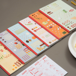
Marco Marco is an Italian restaurant business with five locations across the city-state of Singapore and an affordable menu made up of international interpretations of classic dishes. These are created from simple recipes inspired by modern food culture using fresh locally sourced ingredients. The name, a reference to the adventures of merchant traveller Marco Polo, was chosen to reflect the international meeting point of ingredients and cultures.
Marco Marco’s brand identity, designed by Acre, draws on the simplicity and accessibility of the experience, the quality and creativity of the dishes and their modern international influences, and visualises these through the juxtaposition of a simple type alongside the detail of deconstructed dish photography. The project included business card and menu design.
Pact designed by Acre
Posted: | Author: Richard Baird | Filed under: Fashion, Logo Reviews, Retail | Tags: Brand Identity Reviews, Branding, Design News, Design Opinion, Design Reviews, Designed by Acre, Designed in Singapore, From Asia, Graphic Design, Logo Design & Branding Blog, Logo Designs, Logos, Marble Patterns, Packaging News, Restaurant & Cafe Menu Designs, Restaurant Logos, Retail Logos, Sans-serif Logotypes, The Best Logo Designs of 2012, Typography, Visual Identity Design Blog, Wood Textures in Brand Identity and Packaging Design | Comments Off on Pact designed by AcrePact is a co-branded venture and partnership between like-minded businesses located in Singapore’s Orchard Central shopping centre. The venture’s visual identity, created by design agency Acre, contrasts the geometry, square terminals and single line weight consistency of a custom ampersand (a simple and universal unifier) and the broadly spaced, neutral sans-serif characters of the logo-type with the organic, dual colour marble finish, uncoated, unbleached material choices, stickers and wood of the collaterals. A simple fusion of fashion and contemporary arts and crafts cues that binds a variety of retailers and services under the themes of evolving, natural and collaborative process and good quality personal service.