Designed by Build
Colours May Vary by Build
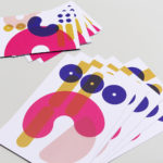
Colours May Vary is a Leeds based creative lifestyle store, independent bookshop and events space. Its physical and digital stores are filled with a variety of products, from riso prints, books and magazines to ceramic sculptures, cards and banners. There is a variety to these objects, yet a curatorial through line of beauty and usefulness that makes the Colours May...

Tulura by Build
Tulura is an independent luxury botanical skincare brand created Eileen Feighny, a former professional model brought up in Korea and now working from New York. The first of Tulura’s products is a two-step moisturising program that includes a vitamin peptide serum and a botanical facial oil made from seasonal ingredients hand picked and custom-blended. Ingredients are chosen for their effectiveness, and formulations created without the use...
The Stow Brothers by Build
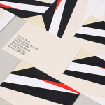
The Stow Brothers is an estate agent working within the area of Walthamstow, a place where urban London meets the Epping Forest, and is described by the estate agent as a rapidly expanding community of like-minded people looking for a place with a strong sense of community, plenty of culture, good food and a decent pint. UK-based graphic design studio Build worked with The...
Studio Aves by Build
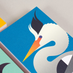
Studio Aves is a soon to launch UK design practice that will specialise in typeface and typographic design. Its visual identity, based around a high contrast colour palette drawn from the markings of British birds — a reflection of the name and inspired by blue tits, goldfinches, magpies, robins plus many more — was recently created by Build. The identity runs...
3angrymen by Build
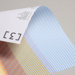
3angrymen is a London based production and digital content company with a client list that includes the NSPCC, ChildLine, Barclaycard, Hovis, Palmolive and TKMaxx. Their new brand identity, designed by Build, draws out the fine colour bands of their previous logo to craft a new, contemporary and sophisticated scan line pattern. Paired with a monospace type choice and contemporary monograms Build’s...