Designed by DNCO
Florentia Village by DNCO
On first hearing, ‘Florentia Village’ is a ridiculous name for a warehouse complex in South Tottenham, as if Hyacinth Bouquet had somehow risen from the grave and gained a seat on the borough council in order to render floridly Italianate a grimy chunk of East London. However, the name does in fact arise from an organic nomenclatural etymology: indicating ‘flourishing’ or...
HUB Residential by DNCO
Property development continues to boom in London. It’s difficult to see how any of this is really benefitting those most in need, or whether housing is even being designed to be resided in at this point, acting as a ‘store of value’ for those much wealthier individuals. Recently developed areas appear like ghost towns at night. Having just moved, and...
Broadgate by dn&co
Broadgate is the largest pedestrianised neighbourhood in Central London. It is adjacent to the busy transport hub of Liverpool Street station, surrounded by Shoreditch, Spitalfields, Old Street and the City, made up of a diverse community and uses that span innovation, finance, food, retail and contemporary cultural activities. The area will receive a £1.5 billion investment to further its development...

V&A Exhibition Road Quarter by dn&co
Exhibition Road Quarter is a new gallery built under and an extension of The Victoria and Albert Museum, London, the world’s largest museum of decorative arts and design. Although the V&A is known for its commitment to innovation its spaces within an early twentieth century Grade 1 listed building set limitations, with temporary retro-fitted interiors proving to be cramped and inflexible....
Elements by dn&co.
Elements is the latest spout and handle range from Brooklyn-based boutique brassware business The Watermark Collection. It features 15 metal finishes, 3 handle designs and 19 hand-crafted covers. These make up a potential quarter of a million possible combinations. The modularity, materiality and variety of Elements is drawn on and expressed through a visual identity created by British design studio dn&co,...

Fathom Architects by dn&co
Fathom is a new UK based architectural practice, set up by Justin Nicholls, former partner at Make Architects and Foster+Partners, that draws beautiful and logical buildings from complex briefs, and within the context of sensitive sites. Fathom Architects worked with dn&co. to develop a visual identity that would encapsulate this focus as well as their curiosity and use of technology....
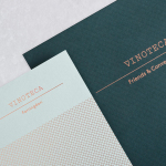
Vinoteca by dn&co
Vinoteca is a group of London based restaurants, founded by business partners and friends Brett Woonton and Charlie Young, that were inspired by the wine bars of Spain and Italy. Aside from the restaurant experience, and as a testament to the quality of their wine list, these restaurants also operate as local wine retailers. dn&co. were commissioned to refresh and formalise Vinoteca’s brand identity. With...

Here East by dn&co.
Here East is a 1.2 million sq ft commercial space developed by Delancey and housed within the former Olympic Press and Broadcast Centre near Hackney Wick in East London. Here East is described as an ecosystem looking to attract businesses from the design, technology and modern manufacturing sectors who are looking to scale, and those of scale looking to behave more creatively....