Designed by Glasfurd & Walker
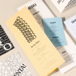
Di Beppe by Glasfurd & Walker
Di Beppe is a casual Italian caffé and ristorante, located in Vancouver’s Gastown neighbourhood, “inspired by the Italian immigrant’s desire to share a piece of home while living abroad”. Di Beppe is said to honour the sense of deep pride and self-assured nature associated within Italian culture through a classic and authentic Italian dining experience and in the design of its graphic identity,...
Earls.67 by Glasfurd & Walker
Earls is a family-owned premium but casual restaurant chain with 66 locations throughout Canada and the United States and a thirty year history. The hospitality sector has seen a lot of change in this time. It continues to be highly competitive and often demands innovation and adaptability to remain relevant. With this in mind, Earls commissioned Canadian graphic design studio Glasfurd & Walker and interior...
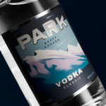
Park Distillery Vodka by Glasfurd & Walker
Park is a bar, restaurant and distillery located in the Canadian resort town of Banff, within the Banff National Park, and the province of Alberta. It is a region of diverse natural beauty, with mountains, prairies, forests and desert badlands that attract walkers, campers and skiers. Park Restaurant is a celebration of Banff’s alpine history and lifestyle. This runs throughout its interior, campfire-inspired menu and a...
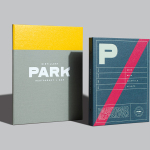
Park Restaurant & Distillery by Glasfurd & Walker
Park is a bar, restaurant and distillery located in the Canadian resort town of Banff, within the Banff National Park, and the province of Alberta. It is a region of diverse natural beauty which includes mountains, prairies, forests and desert badlands, and that attracts walkers, campers and skiers locally and internationally. The restaurant is a celebration of Banff’s alpine history and lifestyle. This runs...