Designed by Horse
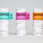
Tapped Birch Water by Horse
Tapped is an organic birch water, drawn straight from trees growing in Finland, and available in Bilberry & Lingonberry, Apple & Root Ginger and unflavoured varieties in the UK from Whole Foods Market, Planet Organic and online. Birch water is a traditional spring time drink and medicinal ingredient in Finland, tapped from birch trees which filter ground water up through their roots and trunk...
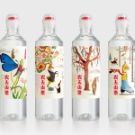
Nongfu Spring Mineral Water by Horse
Nongfu Spring is a bottled mineral water brand and a leading Chinese beverage business. Nongfu worked with British design studio Horse to develop a new package design treatment that, using labels illustrated by designer Brett Ryder and a distinctive structural design with a slim profile and proprietary leak-free sports cap, would engage the youth market....
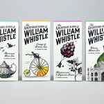
The Adventurous Blends of William Whistle by Horse
The Adventurous Blends 0f William Whistle is a small tea and coffee merchant crafting exotic flavoured teas, coffees and tisane from the highest quality ingredients sourced from across the world using an approach that is described as bringing together the very best discoveries of the past with the expertise of the present. This philosophy, as well as the merchant’s well-travelled and eccentric English nature, informed...