Posted: | Author: Richard Baird | Filed under: Logo Reviews | Tags: Brand Guidelines, Brand Identity, Brand Identity Reviews, Branding, Branding Blog, Branding Reviews, British Design, Brochure Design, Business Card Design, Catalogue Design, Colorplan Papers and Boards, Design For Print, Design News, Design Opinion, Design Reviews, Designed by KVGD, Designed in Glasgow, Emboss Detail, Fonts in Use: Trade Gothic, From Europe, From the United Kingdom, G.F Smith Papers & Boards, Gold Foil, Gold Ink, Graphic Design, Graphic Design Blog, Logo Design & Branding Blog, Logo Design Inspiration, Logo Design Resource, Logo Designs, Logo Opinion, Logotypes, Metallic Spot Colours, Monolinear Typography, Sans-serif Typography, Scottish Design, The Best Brand Identities of 2015, The Best Logo Designs of 2015, Tote Bag Design, Transport Logos, Typography, Uncoated Papers & Cards | Opinion by Richard Baird.
Borders Railway is 30 miles of new track, built largely upon the old Waverley Line, that runs between Edinburgh and Tweedbank within the Scottish Borders. Its commissioning saw the end of a fifty year wait for train services to be reinstated in the region and is the longest new domestic railway to be constructed in Britain for over 100 years.
The line was opened by Her Majesty The Queen, accompanied by the Duke of Edinburgh, on September 6th, and was marked by a journey from Edinburgh, aboard a steam engine, and by the unveiling of a plaque at Tweedbank station.
Stark Events commissioned Glasgow based graphic design studio KVGD to develop a visual identity for the opening of the railway. This included logo design, commemorative brochure, tickets, plaque and brand guidelines, and also extended to badges, flags, tote bags and banners.
Continue reading this article
Posted: | Author: Richard Baird | Filed under: Art and Design, Logo Reviews, Self-Initiated | Tags: Brand Identity, Brand Identity Design, Brand Identity Reviews, Branding, Branding Blog, Branding Reviews, Business Card Design, Colorplan Papers and Boards, Coloured Paper, Colourful Business Cards, Design Studio Logos, Designed by KVGD, Designed in Glasgow, Duplex Business Cards, Graphic Design, Letterpress Business Cards, Logo Design & Branding Blog, Logo Designs, Logo News, Logotypes, New Logo, Sans-serif Logotypes, Scottish Design, Stationery Design, Stitch Detail, The Best Brand Identities of 2014, The Best Business Cards of 2014, The Best Logo Designs of 2014, Type Foundry: Klim Type Foundry |
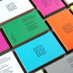
KVGD is a Glasgow based graphic design studio run by Kerr Vernon that works within the fields of brand identity design and print, has a ‘be nice, do good work’ philosophy, and a reputation for producing engaging, thoughtful and crafted projects. The studio’s client base is diverse, local and national, and includes businesses such as gallery, event and creative workspace The Whisky Bond, eco-friendly goods co-op Greencity Wholefoods and the restaurant Ox and Finch. KVGD recently implemented a new visual identity treatment which included logo, duplex business cards, promotional booklets and website that, through brightly coloured papers, type from New Zealand foundry Klim, letterpress print finish and open stitched detail, draws out the crafted nature of the the studio’s work.
Continue reading this article