Cooke Curtis & Co. by The District, United Kingdom
Posted: Filed under: Graphic Design Reviews, Logo Reviews, Property | Tags: Animated Logos, Black and White, Black Paper, Blind Emboss, Brand Identity Reviews, Branding, Branding Agency, Branding Blog, Branding Reviews, British Design, Brochure Design, Business Card Design, Catalogue Design, Coloured Paper, Custom Typefaces & Logotypes, Custom Typography, Design For Print, Design News, Design Opinion, Design Reviews, Designed by Parent, Designed by The District, Duplex Business Cards, Estate Agent, Fonts in Use: Avenir, From Europe, From the United Kingdom, Glossy Paper Examples, Graphic Design, Graphic Design Blog, Graphic Design Trends: Monolinear Illustration, Logo Design & Branding Blog, Logo Design Trends: Dynamic Logos, Logotypes, Monochromatic Brand Identities, Responsive Websites, Sans-serif Typography, The Best Brand Identities of 2016, The Best Business Cards of 2016, The Best Custom Logotypes, The Best Graphic Design Work of 2016, The Best Logo Designs of 2016, The Very Best of 2016, Typography, Uncoated Papers & Cards Comments Off on Cooke Curtis & Co. by The District, United KingdomOpinion by Richard Baird.
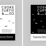
Cooke Curtis & Co. is an award-winning estate agent with an office in Cambridge, United Kingdom. It has a portfolio and a thorough understanding of properties throughout the city and in neighbouring villages. Although the business was established last year, its founders have over thirty-five years of industry experience.
Local graphic design studio The District were commissioned by the estate agent to develop a visual identity that would work across a broad range of printed and digital media, from business cards, letterheads, brochure and website to ‘for sale’ signs, vehicle graphics and key rings.
With the intention of delivering a distinctive and impactful solution sensitive to the heritage of the founders, and the will to cut through the hyperbole of the industry, The District took a bold typographic approach that discards photography in favour of a monolinear geometric sans-serif and underlines, emphasised by a black and white colour palette.
HenshawFox by Parent, United Kingdom
Posted: Filed under: Logo Reviews, Property | Tags: Brand Guidelines, Brand Identity Reviews, Branding, Branding & Interior Design, Branding Blog, Branding Reviews, British Design, Brochure Design, Catalogue Design, Colour in Use: Green, Coloured Paper, Design For Print, Design News, Design Opinion, Design Reviews, Designed by Parent, Estate Agent, From Europe, From the United Kingdom, Graphic Design, Graphic Design Blog, Logo Design & Branding Blog, Logotypes, Sans-serif Typography, Sign Design, The Best Brand Identities of 2016, The Best Business Cards of 2016, The Best Graphic Design Work of 2016, The Best Logo Designs of 2016, Typography, Uncoated Papers & Cards Comments Off on HenshawFox by Parent, United KingdomOpinion by Richard Baird.
HenshawFox is a family run and independent estate agent with properties in and around the town of Romsey, United Kingdom. With a desire to move into the higher end of the market, from between £250k – £350k to £500k+, within the next two years, the estate agent commissioned graphic design studio Parent to develop their brand identity and interior design for their landmark office. This was to be more upmarket, aspirational and smart enough to compete with national brands. Alongside strategy and interior design, Parent developed and designed brand guidelines, brochures, signage and business cards.
Devall & Son designed by Parent
Posted: Filed under: Logo Reviews | Tags: Brand Identity, Brand Identity Reviews, Branding, Branding News, British Design, Business Card Design, Coloured Paper, Copper Block Foil, Design For Print, Design News, Design Opinion, Design Reviews, Designed by Parent, Edge Painted Detail, Fonts in Use: Avenir, Graphic Design, Graphic Design Blog, Logo Design & Branding Blog, Logo Designs, Logo News, Logo Opinion, Logos, Logotypes, New Logo, Sans-serif Logotypes, Typography, Uncoated Papers & Cards, Visual Identity Design Blog Comments Off on Devall & Son designed by ParentOpinion by Richard Baird.
Devall & Son is a funeral directors, monumental mason and family business with a history that dates back 28 years. To coincide with a transition from one generation to the next D.B.Devall & Son commissioned Bournemouth-based design studio Parent to help them rebrand their business. This included new stationery, brochures, website and signage bound by a simplified name, a logotype built from a bespoke inline sans-serif, and in print by coloured paper and board, a copper foil print finish, edge painted detail and abstract images by photographer Steven Friedman.