Sydlexia: Making Sense Of Dyslexia by BBDO Dubai, UAE
Posted: Filed under: Education, Graphic Design Reviews, Logo Reviews | Tags: Brand Identity, Brand Identity Reviews, Branding, Branding & Packaging of 2017, Branding Blog, Branding Reviews, Campaign Design, Colour in Use: Pastels, Design Blog, Design News, Design Opinion, Design Reviews, Designed in Dubai, Designed in Sydney, Graphic Design, Graphic Design Blog, Graphic Design Shortlist 2017, Logo Design & Branding Blog, Logo Design Resource, Logo Opinion, Logos, Logotypes, Pastel Colours, Poster Design, Sign Design, Smile In The Mind, The Best Graphic Design Work of 2017, The Best New Logo Designs of 2017, The Very Best Brand Identities of 2017, The Very Best of 2017, Type Play, Typography Comments Off on Sydlexia: Making Sense Of Dyslexia by BBDO Dubai, UAEOpinion by Richard Baird.
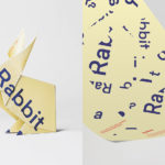
Sydney Dyslexia intends to challenge the misconception that dyslexia is a learning disability, and instead, move the conversation forward, to more appropriately address it as a learning difference. Sydlexia is an innovative and pioneering platform, created by Sydney Dyslexia, to help aid this change, and offers new techniques and training methods to help facilitate “dyslexia correction”.
Dyslexia is the most common learning disorder. It affects 1 in 10 people worldwide. It is indifferent, and its challenges are felt by those from all walks of life. Sydlexia worked with BBDO Dubai on brand identity and its first campaign with the intention of engaging a diverse group of people.
Taking their cues from the universal notion of dyslexia as a learning difference that breaks up and rearranges letters and words, BBDO finds a convivial, modern and universal expression that draws a lot of visual and cognitive equity from simple typographical play, the fracturing of words and the process of their reconstruction.