Exhibition Design
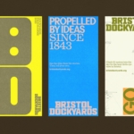
How & How takes a smart, bright collage-based approach to overhauling Bristol Dockyards
For those outside of Bristol, it’s all too easy to assume that the city is merely a place where Triphop and Dubstep were born; a Mecca for trustafarian types on a perennial ‘gap yahhh’ wearing those trousers that make people look as if they’ve had some sort of toilet issue; a place where the streets are paved with ketamine and...
Who knew a spiral could do so much? Pentagram did, in this joyful Tokyo museum identity
The Museum of Narratives (also known as MoN Takanawa) is located in Tokyo’s Takanawa Gateway City, and opened a couple of months ago in March 2026. It’s something of an experimental museum with a cross-disciplinary programme spanning visual art, installations, and performances themed around everything from society to art to science, manga, and anime; merging traditional Japanese culture with hyper-modern,...
Koto breathes new life into Floridian arts institution The Norton
The Norton Museum of Art began life in 1941 in West Palm Beach, Florida, and in the near-century since, its whole raison d’être has been based around its role as a place where “art and life meet as a part of everyday art”. As such, it acts as more than a look-don’t-touch-style gallery space: the garden, gallery and restaurant are...
Off-kilter and elevated
St Paul’s Cathedral is undoubtedly one of the most iconic, recognisable landmarks of London’s skyline: its vast dome, all beautiful copper-tarnished turquoise, resplendent with dazzlingly golden pineapples (one of its architect Sir Christopher Wren’s favourite accoutrements, and back in the 17th century a distinct status symbol representing all that was bountiful and exotic). Until 1963, St Paul’s was the tallest...
Kanal by Base Design
Kanal is a museum-to-be with an admirable yet bold raison d’être that defies much of what we think we know about the nature of highbrow cultural sites: not a “finished institution, but a cultural project in motion,” as its general director Yves Goldstein puts it. Based in Brussels, Kanal will – somewhat surprisingly – become the city’s only museum of...
Kunsthalle Basel by Porto Rocha
Basel is a fascinating place – beautiful but unassuming, relatively small but the undisputed capital of the contemporary art world. Not only is it the host of – as you’d guess from the name – Art Basel, the Art Fair that arguably forms the pinnacle of the global art market calendar, but it also has one of the highest densities...
The Huntington by Base Design
There’s a particular kind of challenge that crops up again and again in cultural branding – not obscurity exactly, but partial recognition. The sort where an institution is famous for one thing, quietly exceptional at several others, and yet rarely understood as a coherent whole. The Huntington, a century-old cultural and research institution in Southern California, sits squarely in that...
Philadelphia Art Museum by Gretel
Creating museum and gallery identities must be both a dream brief and an intimidating prospect for brand designers; a poisoned chalice of sorts. We hear the same challenges time and again when agencies discuss such projects: creating a brand that’s both strong and ownable but which lets the artefacts/art take centre stage; an identity that takes an institution into the...
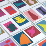
Cult 20 Years, Event & Exhibition by Toko
In 2017 Australian furniture retailer Cult celebrated its 20th anniversary. They marked this with an event and exhibition and worked with design studio Toko to develop a graphic identity to unify these and bring to light their extensive catalogue. Through a mix of bright illustrative silhouettes across invitations, packaging, postcards, flags and banners, the art direction of some Cult’s ranges, and...
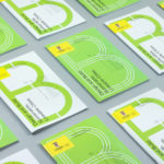
UNSW Built Environment by Toko
UNSW Built Environment (BE) intends to develop global leaders in architecture, planning and construction, and help shape resilient, connected, smart and inclusive future cities through its undergraduate, postgraduate and postgraduate research courses. As part of this, the faculty also runs an annual programme of events for students, academics, industry professionals and the general public. These serve as a platform to find out...
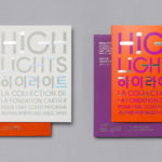
Highlights by Studio fnt
Highlights is an exhibition of works from French contemporary art museum The Collection of the Fondation Cartier pour l’art contemporain at the Seoul Museum of Art (SeMA). The exhibition runs from May 30th to August 15, 2017, features work by artists such as Ron Mueck, David Lynch and Sarah Sze, and also includes commissioned pieces and major artworks by Korean artists. Highlights is curated...

In Search Of The Present at EMMA by Werklig
In Search Of The Present is a new series of exhibitions on a 3–4 year cycle held at Helsinki’s Espoo Museum of Modern Art (EMMA). These intend to tackle many of the existential questions that we face in an ever changing world. The first exhibition, inspired by Olavi Paavolainen’s essay collection from 1929, took place between October ’16 – January ’17 and was a study in the representations...