One Wellington St Kilda by Studio Ongarato
Posted: Filed under: Graphic Design Reviews, Property | Tags: Best Brochure Design 2019, Brand Identity, Brand Identity Reviews, Branding, Branding Blog, Branding Reviews, Design Blog, Design For Print, Design News, Design Opinion, Design Reviews, Designed by Studio Ongarato Design, Designed in Melbourne, Fitzroy Melbourne Australia, Form Language, From Australia, Graphic Design, Graphic Design Blog, Material Thinking, Property Development Logos, Sans-serif Typography, The Very Best of 2019, Typography Comments Off on One Wellington St Kilda by Studio OngaratoOpinion by Richard Baird
One Wellington, a partnership between LAS Group and Qualitas, is a new property development located in the Melbourne suburb of St Kilda, not far from eclectic Fitzroy Street. The building’s architecture—designed by KPDO and comprised of 181 apartments across two buildings of 26 and 10 floors—features flowing curves inspired by its bayside location, highly-customisable interior options and unobstructed sky views. One Wellington is described as dramatic architectural expression on the skyline and an entry statement into St Kilda from the north.
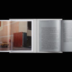
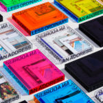
Building on the highly-customisable and luxurious interior designs of KPDO, Studio Ongarato developed a visual identity and campaign directed towards a specific mindset and that draws on the multi-faceted sub-cultures of the area rather than a target market profile. This manifests itself, unusually, in a shifting tone throughout printed communications, moving from the sophisticated to the youthful, and from serious to humorous using photography, type, illustration and photography. Through this approach, Studio Ongarato’s campaign invites prospective residents to live ‘A life less ordinary’.
The One Wellington campaign identity is made up of a hardcover book, softcover booklets, posters, postcards and multi-format cards. Each unveils authentic stories from unexpected perspectives using a variety of creative techniques.