Fonts by Hoefler & Co.
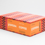
Víspera Coffee by Stockholm Design Lab
Víspera is premium coffee brand that intends to bring together the best of two worlds, a blend of 100% Arabica coffee beans sourced from the high altitude plantations of Colombia and a Swedish eye for quality and craftsmanship in its roasting. This meeting is visually articulated through type contrast, colour and pattern across Víspera’s packaging, developed by Stockholm Design Lab....
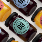
Danish Selection by Kontrapunkt
Danish Selection is a new range of high-quality fruit spreads cut with alcohol. The range includes blackcurrant infused with Jamaican rum, orange with cognac and a wild blueberry variety with Scotch whiskey. Orkla, the company behind Danish Selection, worked with Copenhagen based graphic design studio Kontrapunkt to develop a packaging treatment that would clearly communicate this new concept to consumers. Kontrapunkt’s solution is...
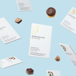
Bombonería Pons by Mucho
Bombonería Pons is a family owned Barcelona based business, established in 1960, dedicated to producing the finest handcrafted chocolates. With a desire to engage with a younger consumer Bombonería Pons worked with international graphic design studio Mucho to develop a brand identity that would be sensitive to its traditional values and history yet give it a contemporary appeal. This extended across packaging, brochure, stationery, business cards and...
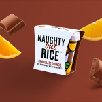
Naughty But Rice by Robot Food
Naughty But Rice is a rice pudding range created by The Hain Daniels Group in response to an increase in the dessert’s popularity in the United Kingdom. Unlike the product’s of established and mainstream brands, Naughty But Rice, as the name suggests, offers consumers a modern and indulgent twist on the traditional favourite, with flavours that include Coconut & Raspberry, Salted Caramel and Chocolate...