Fonts in Use: Gill Sans
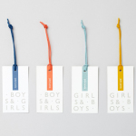
John Lewis Childrenswear by Charlie Smith Design
London-based studio Charlie Smith Design worked with British department store John Lewis to develop the visual identity system and packaging for their childrenswear department. The system needed to appeal to girls and boys aged from 2 to 14 (and presumably their parents), and connect a broad range of accessories and garments that included denim, swimwear, shoes and underwear. The result is as a...
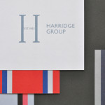
Harridge Group by Igloo
Harridge, formerly Ealing Travel Services, is a corporate travel group made up of Harridge Business Travel, Harridge Luxury and Harridge Events. London-based design studio Igloo were recently commissioned to design the group’s visual identity and brand architecture which would reference its “significant history and experience”. Their design solution, a combination of serif detail, sans-serif characters and a modern colour palette and pattern set, drawing on...