Fonts In Use: Suisse Int’l
Fergus by Principal Studio
Organic food brands often land in the same visual territory as many vegan and eco-conscious counterparts – but when did the pursuit of consumer trust become so entwined with muted colour palettes, illustrated veg and rustic textures? There’s nothing inherently problematic with this combination of design elements, yet it has become a tired and overused formula for brands operating in...
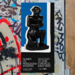
Sumer And The Modern Paradigm by Clase bcn
Sumer And The Modern Paradigm is an exhibition at Barcelona’s contemporary art gallery Fundació Joan Miró, and runs from 28th October 2017 to 21st January 2018. It intends explore and attempt to explain the influence of Mesopotamian art on modern artists, with a particular focus on the interwar period. The exhibition analyses work produced between the twenties and forties, takes a look...
AIGA Design Conference by Mother Design
The American Institute of Graphic Arts (AIGA) is a professional design organisation with a membership that covers all forms of visual communication, from graphic design, typography and interaction to branding, motion graphics and environmental design. As well as supporting a community of over 25,000 nationwide members, advancing design as a professional craft, strategic advantage and vital cultural force, AIGA organises two...
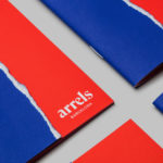
Arrels by Hey
Arrels (roots in English) is a Spanish shoe brand, established by cousins, friends and partners Javier & Pepe Llaudet, and inspired by the Mediterranean, its traditions, rhythm, colour and creative atmosphere. Javier & Pepe also draw on the city of Barcelona (the place they want to be), the countryside (where they are from), and their passion for music. These inspirations make their way into Arrels’ new brand identity,...