PopTech by Collins
PopTech is an annual three-day conference that takes place in October in the American town of Camden, Maine. It is an occasion where people from across many different fields meet with the intention of discovering and exploring a shared potential that reaches far beyond individual aspirations and goes on to inspire positive collective action. Attendees include scientists, technologists, humanitarians, designers, artists,...
CareerTrackers by Garbett
CareerTrackers is an Australian nation-wide charitable organisation that addresses Indigenous disadvantage by developing professional career pathways, internship programs and links with private sector employers for Indigenous university students. It does this through a model adapted from an African-American internship program which has a proven legacy of 45 years. This is based on an approach that sees students intern with sponsoring companies...

Enter Arkitektur by Lundgren+Lindqvist
Enter Arkitektur is a Swedish two-office architectural practice located in the cities of Jönköping and Gothenburg. It has a rich history that goes back to the 1950’s and a portfolio that moves between residential housing and commercial building projects. In response to restructuring and expansion, the practice worked with Lundgren+Lindqvist to develop a graphic identity that would better represent their...
The East Cut by Collins
The East Cut unifies the three distinct downtown San Francisco areas of Transbay, Folsom and Rincon Hill into a single and modern metropolitan community. It is a unique an area, now recognised by Google Maps, that contains the newest and largest building in the city but also those that are the oldest and historically rich. Collins worked to develop a name and graphic identity for this new...
Helsinki by Werklig
In August 2017 Scandinavian design studio Werklig was commissioned to develop the graphic identity for the Finnish city of Helsinki, a capital with an urban region of roughly 1.4 million inhabitants and 751,000 jobs. The challenge was to resolve a disparate and fragmented visual system that represented a broad range of public services, departments and development projects that were helping and...
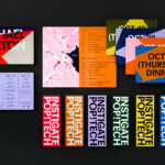
UNSW Built Environment by Toko
UNSW Built Environment (BE) intends to develop global leaders in architecture, planning and construction, and help shape resilient, connected, smart and inclusive future cities through its undergraduate, postgraduate and postgraduate research courses. As part of this, the faculty also runs an annual programme of events for students, academics, industry professionals and the general public. These serve as a platform to find out...
Broadgate by dn&co
Broadgate is the largest pedestrianised neighbourhood in Central London. It is adjacent to the busy transport hub of Liverpool Street station, surrounded by Shoreditch, Spitalfields, Old Street and the City, made up of a diverse community and uses that span innovation, finance, food, retail and contemporary cultural activities. The area will receive a £1.5 billion investment to further its development...
Fluvia by Folch
Fluvia is a range of adaptable lighting solutions from LED Simon that intends to offer a creative freedom in commercial and private lighting projects. Design, rather than an absolute utility, is an essential and unifying quality of the range with products developed to be attractive and convenient, easy to use and deploy within a space, and broken down and recycled....