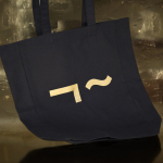
Linden Staub by Bibliothèque
Linden Stuab is a UK-based model agency challenging industry conventions with their mantra ‘Empowering Women’, and by acting as a mother agency to all of their models. The name Linden Staub, derived from the maiden names of the two founding partner’s mothers, is an expression of this, and alongside the agency’s strong human-focus, was the basis for their new brand identity, created...
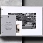
Wenford Dries by ico Design
Wenford Dries is a new property development in the scenic area of North Cornwall. It will be made up of loft-style homes, artist studios, allotments and wild gardens, set on the site, and within the structure of, a former clay drying factory that dates back to the beginning of the 20th century. This is said to have been sensitively restored. The development is billed as...
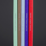
Strategy Thinking Issue 5 by Strategy
Strategy Thinking™ is an ongoing self-published series from New Zealand, Australia and Tokyo based graphic design studio Strategy. It provides the studio with a concise and compelling platform to showcase their work, communicate how they help their clients, and convey the insight and creative thinking that unites their five studios. The series also includes in-depth case studies and articles. The latest edition...

Signet 100 HB Pencils by Well Made Studio
Signet is a new pencil range developed by British home, outdoor and lifestyle retailer Pedlars, who applied their expertise to an own-brand product line following a lengthy international search for the perfect pencil. 100, the first of the Signet range and launched in November this year, is made from American basswood, finished in orange with a silver foil detail and crafted by a long-established family-run business...