Gin Branding
ITO Gin by Analogue
ITO Gin is first and foremost, brilliantly eyecatching – huge fluorescent letters, the epitome of ‘make it big’ when it comes to a brand name; deep black bottles – behind this bold exterior lies a narrative woven across cultures, histories, and generations. The brand was born of a collaboration between Komaki Distillery in Japan and UK-based gin brand Kokoro. However,...
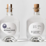
Monachus Distillery by Bedow
Atop of Croatia’s Istria peninsula, just where the land slips into the Adriatic sea sits the tiny small-batch gin distillery of Monachus. Stone shores, botanical covered hillsides, the smell of pine and scattered pin cones characterises the landscape. Drawing on this, the natural history of Istria and the name Monachus, borrowed from Monachus Monachus an endangered Mediterranean monk seal, Swedish design studio Bedow created a...