Fonts in Use: GT Sectra
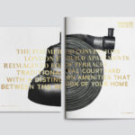
Brigade Court by Jack Renwick Studio
In The London Borough of Southwark sits the Grade II listed building and former headquarters of the London Fire Brigade, the city’s first fire station and a site currently under development. This will see it transformed into residential apartments with period conversations of the original Victorian building alongside a modern new-build. It is a one-of-kind property development that offers a...
The Broadview Hotel by Blok
The Broadview Hotel is located within one of Toronto’s most recognisable architectural landmarks. This was built in 1891 by a wealthy businessman who recognised the strategic importance of the East End as the city was expanding. It has been home to a business centre, acted as a political and social hub, and used as a hotel, boarding room and more recently, a...
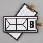
Hidden Characters by RE
Hidden Characters is the latest PR offering from international advertising agency network M&CSaatchi. It replaces/is an evolution of Bang PR, developed in response to the changing public relations landscape. With the advent of social media and the subsequent growth of non-traditional influencers and an increase in inauthentic product placement, Hidden Characters intends to make sure that their client’s reach is handled in an ethical and authentic...
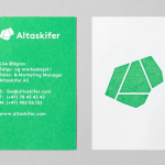
Altaskifer by Neue
Alta Quartzite is a natural building material quarried from the mountains of Norway’s Alta region with a unique green/grey colour, fine texture and hard wearing non-slip properties. These make it a good choice for both interior and exterior applications, from roofing, paving and staircases, to roads and walkways. Although it is material with a long history of use it is...
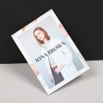
Iona Brown by Sam Flaherty
Iona Brown is a London based contemporary jewellery designer who favours classic simplicity, understated detail, precise finishes and minimalist lines, shapes and materials. Graphic designer and art director Sam Flaherty recently worked with Iona to develop a new visual identity for her expanding collection. Built around a customised logotype and a simple print and packaging treatment that uses few but good quality and contrasting...