Fonts in Use: Knockout
New Victory Theatre by Pentagram
The New Victory Theatre, located on New York’s 42nd Street, is described as the city’s first and only not for profit performing arts venue for kids and families. It has a programme that covers a multitude of artistic disciplines and draws on traditions from a variety of cultures. Alongside performances and family workshops the theatre also seeks to offer performing arts...
Shakespeare In The Park 2019 by Pentagram
Shakespeare In The Park is an annual event and duo of free performances presented by New York’s The Public that takes place at the Delacorte Theater in Central Park in May and June. 2019 saw performances of Much Ado About Nothing and Coriolanus under the theme “Rumours and Rebels”. The event was promoted through a city-wide campaign developed by Pentagram’s...
Shakespeare In The Park 2018 by Pentagram
Shakespeare In The Park is an annual event and series of free performances presented by New York’s The Public Theatre that will take place at the Delacorte Theater in Central Park during May and throughout June. This year will see performances of Othello and Twelfth Night. These are being promoted by a campaign developed by Pentagram’s Paula Scher, with assets...
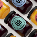
Danish Selection by Kontrapunkt
Danish Selection is a new range of high-quality fruit spreads cut with alcohol. The range includes blackcurrant infused with Jamaican rum, orange with cognac and a wild blueberry variety with Scotch whiskey. Orkla, the company behind Danish Selection, worked with Copenhagen based graphic design studio Kontrapunkt to develop a packaging treatment that would clearly communicate this new concept to consumers. Kontrapunkt’s solution is...
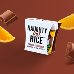
Naughty But Rice by Robot Food
Naughty But Rice is a rice pudding range created by The Hain Daniels Group in response to an increase in the dessert’s popularity in the United Kingdom. Unlike the product’s of established and mainstream brands, Naughty But Rice, as the name suggests, offers consumers a modern and indulgent twist on the traditional favourite, with flavours that include Coconut & Raspberry, Salted Caramel and Chocolate...
Candlefish by Fuzzco
Candlefish is a Charleston, South Carolina, store that stocks a carefully curated collection of scented candles from an assortment of brands including Rewined and Produce, and also plays host to a variety of workshops. The store takes its name from the Eulachon, better known as the Candlefish. After drying, and due to its high oil content, the Candlefish burns much like a candle and...
Huckle & Goose by Cast Iron
Huckle & Goose is an online food service that delivers weekly seasonal recipes to subscribers with the intention of making it simple and easy for the conscientious home cook to plan meals according to what’s in season at the local farmers’ market. Colorado-based Cast Iron Design were appointed to bring Huckle & Goose to life, developing a brand identity which included a...