Logistics Logos
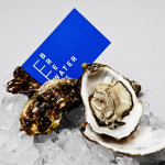
Breakwater by Lundgren+Lindqvist
Breakwater is a Swedish logistics company that services the marine cargo sector. Their visual identity and stationery, created by Gothemburg-based studio Lundgren+Lindqvist, brings together the themes of open sea, systems and cargo through the vertical and horizontal intersection of a geometric sans serif, simple grid-based layout, plenty of space and a vivid blue and icy white colour palette....
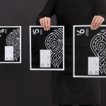
Simplified Sending by Designworks
Simplified Sending is a complete package and post solution from New Zealand’s postal authority that simplifies the process of sending parcels to anywhere in the country. Created by Designworks the result is an interesting mix of utilitarian functionality, contrasting illustrative flourish and a monochromatic colour palette that takes the expected black on white print treatment and confidently inverts it....

Norwegian Shipowners’ Association by Neue
Norwegian Shipowners’ Association is a group of businesses that collectively employ over 55,000 seafarers and offshore workers from more than 50 different nations. The association’s new visual identity, created by Oslo based design agency Neue, captures the open sea and sense of knowledge and experience with a two colour square and traditional serif combination....