Loyalty Card Design
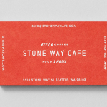
Stone Way Cafe by Shore
Stone Way Cafe, formerly the Tiny Ninja Cafe, is a Seattle based neighbourhood meeting point, music venue and internet cafe, in the area of Fremont, with a formidable, geometric, concrete exterior structure and a warmer interior of wood surfaces created by goCstudio. Design studio Shore, working closely with signwriters and fabricators, created a brand identity treatment for the cafe, which included...
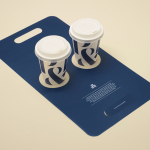
Pablo & Rusty’s by Manual
Pablo & Rusty’s is a small-batch coffee roaster, wholesaler, retailer and cafe with four locations in and around Sydney, and a company culture passionate about sustainability and the pursuit of perfection. San Francisco based studio Manual created a visual identity for Pablo & Rusty’s that would better reflect their values, was sensitive to local coffee culture and is described as having a level...