Merchandise design

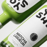
Yoshi by Saint-Urbain
Early days for sure, but this is hands down the best brand identity design I’ve seen this year – kudos to Saint-Urbain for once again putting a project out into the world that’s not only an absolute joy to look at, but which shows a razor-sharp nous for branding that’s both searingly zeitgeist and resolutely, timelessly future-facing. Said project is...
ITO Gin by Analogue
ITO Gin is first and foremost, brilliantly eyecatching – huge fluorescent letters, the epitome of ‘make it big’ when it comes to a brand name; deep black bottles – behind this bold exterior lies a narrative woven across cultures, histories, and generations. The brand was born of a collaboration between Komaki Distillery in Japan and UK-based gin brand Kokoro. However,...
TwelveLabs by Pentagram
Remember when the conversation around gradients was about making ‘bad’ design look ‘better’? When RGB colours were frowned upon because you couldn’t print them? Yeah, those ideas feel a bit outdated now. HP Indigo can now run fluorescents affordably, and business card mock-ups (in RGB) are more about selling than printing. Technology marches on, expectations and standards evolve, and everything...
Hip Pop by Robot Food
Running a design blog sharpens your eye for category conventions. Stick with it long enough, though, and you’ll start to see those conventions unravel. What once felt fixed begins to flex. This creates a challenge for writing about design: you’re constantly assessing the landscape, but that landscape is always shifting. Take minimalism, for example. Once the dominant aesthetic of the...

Yaté by Herefor
Long gone are the days when ‘energy drink’ connoted unwashed teenage gamers, amped up Twitch streamers, hungover/still going city boys on the Tube, or 2-4-1 deals on vodka Red Bull in sticky-floored suburban student nightclubs. Like many things – such as reading books, going for a walk, or having a bath – the energy drink sphere has now collided with...

Suupaa by A Friend of Mine
There isn’t a shortage of well-executed, interesting branding projects out there – ones that are joyful, witty, slick, or just perfectly fit a brief – which do their job perfectly. But 99% of the time, you can sort of see where they came from – the broader cultural spheres they’re playing into (nostalgia; fauxstalgia; irony, for instance) or the wider...

Buena Fé by Saint Urbain
Buena Fé is the first 100% organic tequila-based cocktail-in-a-can, and is made in Jalisco, Mexico, the ‘birthplace of tequila’, where the spirit was first distilled. The drink is made with 100% Blue Weber Blanco tequila, which means that all the alcohol in Buena Fé comes from the agave plant. Unlike your short Margarita, or shortish Paloma, these ready-to-drink cocktails are...
Dark Arts Coffee by NOT Wieden+Kennedy
If a brand that fuses memes, hot takes, occultism, and coffee is going to succeed anywhere, it’s probably in east London. Dark Arts Coffee started out in 2014 in a Homerton railway arch, and managed to corner that distinct subgenre of goth/metal/biker-ish aesthetics which opts for craft ale over snakebite; Hackney over Camden; self-care over self-destruction. Where the old guard,...
Wholy Greens by Control Studio
Wholy Greens is a B-Corp certified Dutch food brand dedicated to transforming the way people perceive and enjoy vegetables. Its mission is to create a mindset shift from ‘having to eat veggies’ to ‘genuinely loving veggies’ – and it uses pasta as its primary vehicle. It’s a smart set up, not least because, frankly, what experiences aren’t more enjoyable when...

Bikedot by Studio Sutherl&
The concept of a brand today rarely has a sense of physicality. The hand (or indeed roller), the mark-maker, usually feels totally absent. It makes sense really, considering our primary interaction with a brand is often online; but when a project comes along that’s so obviously delighting in the possibilities of print processes, inks and paper it feels like a...
Hanbury by Base Design
Hanbury is an American architecture firm, founded in 1979 and based in Virginia. According to international agency Base Design, which recently delivered a rebrand for the practice, the last decade has witnessed a ‘transformative’ period of growth and diversification with the team increasing from 40 to 160 individuals, and expanding from one to eight office spaces. For Hanbury, which started...
Pomus by Sömestr Studio
Branding a film production company is a delicate business. On the one hand, you need branding that can match and even enhance the quality of the films being produced, but on the other, you need something that doesn’t distract from the work or compete with it. Film is an intrinsically creative visual medium, and building a framework to support it...