Fonts in Use: Neuzeit
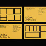
MOAA Architects by Inhouse
MOAA Architects was founded in 2010. It has an office in Hamilton, New Zealand, and a portfolio of new builds and renovations that span the residential, education, commercial and public sectors. Highlights include their work on St. Johns Church, a square plan rotated 9 degrees off the street grid, and Piako House, a renovation and extension of 1940s domestic planning to meet a 21st...
The Broadview Hotel by Blok
The Broadview Hotel is located within one of Toronto’s most recognisable architectural landmarks. This was built in 1891 by a wealthy businessman who recognised the strategic importance of the East End as the city was expanding. It has been home to a business centre, acted as a political and social hub, and used as a hotel, boarding room and more recently, a...
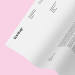
Korshags by Kurppa Hosk
Korshags is a family-owned seafood company located in Falkenberg on the Swedish west coast. Previously named Falkenbergs Lax (Falkenberg’s Salmon), Korshags has grown from a small local company specialising in smoked salmon, into an international player with a variety of products. With this in mind the company commissioned Stockholm-based Kurppa Hosk to establish a new name and brand identity that would better position...
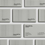
Ascui & Co. Architects by Grosz Co. Lab
Ascui & Co. Architects is an Melbourne-based studio with a rich history, depth of experience and a vision they describe as being a true perspective rather than one founded on intuition. Their projects are considered smart and environmentally sustainable, unexpected yet grounded by purpose, and range from residential additions to multimillion-dollar commercial developments. Anchored in the concept of Process & Possibility — a maxim that refers...
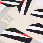
Studio Aves by Build
Studio Aves is a soon to launch UK design practice that will specialise in typeface and typographic design. Its visual identity, based around a high contrast colour palette drawn from the markings of British birds — a reflection of the name and inspired by blue tits, goldfinches, magpies, robins plus many more — was recently created by Build. The identity runs...