Designed by Parallax Design
Penley Estate by Parallax Design
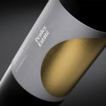
Penley Estate is a family run winery established in 1989 by Kym Tolley and located in the wine growing area of Coonawarra, Australia. It produces wines that are described as having discernible regional character and are made from fruit grown in Terra Rossa soil; a red clay type created by the weathering of limestone. Penley Estate, since its inception, has...

Fox Real Estate by Parallax
Fox is described by Parallax Design, the Australian graphic design studio behind its new brand identity, as one of Adelaide’s most respected boutique real estate agencies. Established in 2005 by Andrew Fox, Fox Real Estate specialises in the selling of high-end properties. Following business growth and to coincide with a move to larger premises, Fox worked with Parallax to develop a...