Pâtisserie Logos & Packaging Design
Black Star Pastry by Studio Ongarato
A visual identity just as Instagrammable as the ‘the world’s most Instagrammed cake’. Sydney bakery Black Star Pastry has been on the ascendancy, from local pastry maker to global cult status, racking up millions of views, thousands of loyal followers and generating hype around its ‘original cakes woven together with poetic storytelling’. Working with Japanese illustrator Noritake, (known for his...
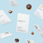
Bombonería Pons by Mucho
Bombonería Pons is a family owned Barcelona based business, established in 1960, dedicated to producing the finest handcrafted chocolates. With a desire to engage with a younger consumer Bombonería Pons worked with international graphic design studio Mucho to develop a brand identity that would be sensitive to its traditional values and history yet give it a contemporary appeal. This extended across packaging, brochure, stationery, business cards and...
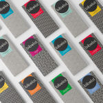
Bibelot by A Friend Of Mine
Bibelot is a luxury European-inspired dessert boutique in Melbourne with a coffee bar, chocolate shop, high tea salon, gelaterie and artisinal patisserie. It features an interior of long marble counters, a light spotted stone floor, spot lighting, cornicing, black and white walls, as well as bronze and tiled detailing. Informed by the sense of place and the permanence that underpins Bibelot’s...
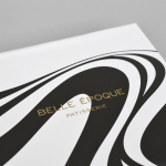
Belle Epoque by Mind Design
Belle Epoque is a French patisserie, located on Islington’s Upper Street, crafting cakes, chocolates, breads, viennoseries, tarts and quiches from high-quality ingredients in a kitchen designed to complement the unrivalled expertise of their chef. Originally commissioned to develop Belle Epoque’s website, Mind Design managed to expand the scope of the project into a full brand identity exercise that went on to include still life...
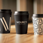
Nourcy by lg2boutique
Nourcy is a delicatessen that has been creating fresh, home-made and original products for thirty years from its location in Quebec City. While providing a contemporary dining environment Nourcy also offers catering services and lunch boxes to customers who have come to expect restaurant-quality at work and at home. In conjunction with a new menu of pastries, an expanded chocolate selection, exclusive gourmet delicacies and the development of a...