Fonts in Use: Pitch
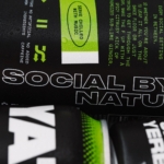
Yaté by Herefor
Long gone are the days when ‘energy drink’ connoted unwashed teenage gamers, amped up Twitch streamers, hungover/still going city boys on the Tube, or 2-4-1 deals on vodka Red Bull in sticky-floored suburban student nightclubs. Like many things – such as reading books, going for a walk, or having a bath – the energy drink sphere has now collided with...
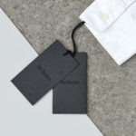
Helbers by Only
Helbers is a Parisian menswear label created by Paul Helbers, the former Head of Menswear at Maison Margiela and ex-Menswear Director at Louis Vuitton. The label has a carefully curated lookbook of garments and footwear with an unpolished elegance, and feature a subtle contrast of materials. Helbers has secured early acclaim for his AW16 collection, and is due to appear in stores around the world in the coming weeks. Paul worked with Leeds-based...
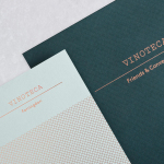
Vinoteca by dn&co
Vinoteca is a group of London based restaurants, founded by business partners and friends Brett Woonton and Charlie Young, that were inspired by the wine bars of Spain and Italy. Aside from the restaurant experience, and as a testament to the quality of their wine list, these restaurants also operate as local wine retailers. dn&co. were commissioned to refresh and formalise Vinoteca’s brand identity. With...