Place Branding
Ambassaden by Bleed
Designed by Finnish-American architect Eero Saarinen, the Ambassaden’s angular modernist stature holds a striking presence in the heart of Oslo. When it opened in 1959, it functioned as the US embassy until its closure in the early 2000s. Fast-forward to today – the building has been reopened and its programming altered. It now operates as a multi-functional space that includes...
West Loop by Landor
The official blurb that surrounds Chicago’s West Loop area is that it’s the city’s ‘hottest neighbourhood… a foodie mecca’, according to Choose Chicago, a ‘cultural powerhouse’, in the words of Landor, which recently created its new brand identity. Having never been to West Loop, or even Chicago, it’s hard to get a grasp of what this all really means. Such...
Blue Mountains by For The People
The Blue Mountains of New South Wales, Australia are not technically mountains at all. They are, rather, a complex labyrinth of dissected plateaus, gorges and valleys of sandstone, formed over 50 million years ago. So far, so deceptive. Fortunately, however, the Blue Mountains are most definitely blue. When the atmospheric temperature of the region rises, a superfine mist of fragrant...
HUB Residential by DNCO
Property development continues to boom in London. It’s difficult to see how any of this is really benefitting those most in need, or whether housing is even being designed to be resided in at this point, acting as a ‘store of value’ for those much wealthier individuals. Recently developed areas appear like ghost towns at night. Having just moved, and...
The East Cut by Collins
The East Cut unifies the three distinct downtown San Francisco areas of Transbay, Folsom and Rincon Hill into a single and modern metropolitan community. It is a unique an area, now recognised by Google Maps, that contains the newest and largest building in the city but also those that are the oldest and historically rich. Collins worked to develop a name and graphic identity for this new...
Helsinki by Werklig
In August 2017 Scandinavian design studio Werklig was commissioned to develop the graphic identity for the Finnish city of Helsinki, a capital with an urban region of roughly 1.4 million inhabitants and 751,000 jobs. The challenge was to resolve a disparate and fragmented visual system that represented a broad range of public services, departments and development projects that were helping and...
Broadgate by dn&co
Broadgate is the largest pedestrianised neighbourhood in Central London. It is adjacent to the busy transport hub of Liverpool Street station, surrounded by Shoreditch, Spitalfields, Old Street and the City, made up of a diverse community and uses that span innovation, finance, food, retail and contemporary cultural activities. The area will receive a £1.5 billion investment to further its development...

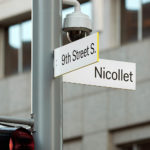
Nicollet by Pentagram
Nicollet Avenue runs between Loring Park and the Mississippi River and is described as the “Main Street” of downtown Minneapolis. It is a cultural and commercial centre, shopping and dining district, and home to flagship stores, major corporations, public transport hubs and landmarks. Nicollet Avenue also includes the Nicollet Mall, the first transit mall in the US, originally opened across eight blocks in 1967...