Printed by Generation Press
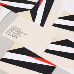
The Stow Brothers by Build
The Stow Brothers is an estate agent working within the area of Walthamstow, a place where urban London meets the Epping Forest, and is described by the estate agent as a rapidly expanding community of like-minded people looking for a place with a strong sense of community, plenty of culture, good food and a decent pint. UK-based graphic design studio Build worked with The...
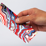
Arjowiggins Curious Matter x FIAC by The Bakery
FIAC is an annual contemporary arts fair where galleries from across the world gather and present work by the emerging artists they represent. The fair takes place at the Grand Palais in Paris and runs for four days during October. Paper merchant Arjowiggins, a longstanding partner, continued to support the event by providing material for FIAC’s catalogue and event guides. This year, these featured a distinctive bookmark...
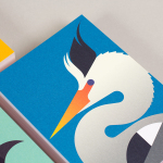
Studio Aves by Build
Studio Aves is a soon to launch UK design practice that will specialise in typeface and typographic design. Its visual identity, based around a high contrast colour palette drawn from the markings of British birds — a reflection of the name and inspired by blue tits, goldfinches, magpies, robins plus many more — was recently created by Build. The identity runs...