Red Block Foil
andSons Chocolatiers by Base Design
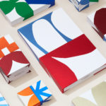
andSons is a second generation chocolatier and retailer run by Marc and Phil Covitz, two brothers who learned everything there is to know about fine chocolate from their mother. Seeking to offer something new to the world of artisanal chocolate, driven forward by Top 10 Pastry Chef Kriss Harvey who joins the brothers, andSons thrashes out a liminal space between...

St. ERHARD by Bedow
With a desire to stand out, and in response to the extensive saturation of heritage-related visual cues throughout the German beer market, brewery St. ERHARD worked outside of the country with Swedish studio Bedow to develop a modern graphic identity for three of its brews. Farmer, Mayflower and Saison are premium beers, each of which are crafted, brewed and bottled by St. Erhard in...
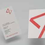
4B Arkitekter by Commando Group
4B Architects is an architecture studio with offices in Oslo, Norway, an experienced team and a holistic approach. It has a particular interest in low energy and sustainable projects, and has built a portfolio of restorations, public, cultural and commercial buildings, private housing and outdoor spaces. The studio’s team of founding partners (from its inception in 1971) and a generation of...