Springs’ Smokery by Distil Studio, United Kingdom
Posted: Filed under: Fonts in Use, Food and Drink, Packaging Reviews | Tags: Best Packaging Designs, Brand Identity Reviews, Branding Blog, Branding Reviews, British Design, Colour in Use: Black, Creative Packaging, Design For Print, Design Opinion, Design Reviews, Designed by Distil Studio, Die Cut Design Detail, From Europe, From the United Kingdom, Graphic Design, Graphic Design Blog, Illustration, Logo Design & Branding Blog, Minimal Design, Packaging Company, Packaging Design, Packaging Design Blog, Packaging Design Resource, Packaging News, Paper and Card Packaging, Sans-serif Typography, Seafood Packaging, Silver Block Foil, The Best Packaging of 2015, The Very Best of 2015, Typography, Uncoated Papers & Cards Comments Off on Springs’ Smokery by Distil Studio, United KingdomOpinion by Richard Baird.
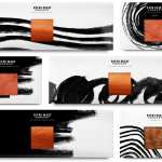
Springs’ Smokery has been producing high quality smoked salmon for three generations from its location in South Downs, UK, using Sussex oak and a traditional dry-salting process which has remained unchanged for 50 years. Springs’ recently worked with graphic design studio Distil to develop a new visual identity and package design. Distil’s treatment is an exercise in aesthetic impact derived from colour and form contrast, and a conceptual and communicative simplicity that makes a connection with the traditional craft and process of smoking salmon but also draws on the themes of heritage and the sea.
Smack Lobster Roll by & Smith, United Kingdom
Posted: Filed under: Cafes, Bars and Restaurants, Logo Reviews | Tags: Brand Identity, Brand Identity Design, Brand Identity Reviews, Branding, Branding Blog, Branding News, Branding Reviews, British Design, Business Card Design, Custom Typefaces & Logotypes, Deli Logos and Packaging, Design For Print, Design News, Design Opinion, Design Reviews, Designed by & Smith, Food Logos and Packaging Design, Food Packaging, From Europe, From the United Kingdom, Graphic Design, Illustration, Logo Design & Branding Blog, Logo Design Inspiration, Logo Designs, Logo News, Logo Opinion, Logotypes, New Logo, Paper and Card Packaging, Poster Design, Restaurant Logos, Seafood Packaging, Serif Logotypes, Sign Design, Slab-serif Logotypes, Spot Colours, The Best Brand Identities of 2015, The Best Custom Logotypes, The Best Logo Designs of 2015, Uncoated Papers & Cards, Visual Identity Design Blog Comments Off on Smack Lobster Roll by & Smith, United KingdomOpinion by Richard Baird.
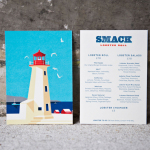
Smack Lobster Roll is a takeaway business, located on Mayfair’s 26 Binney Street, serving freshly cooked lobster in brioche rolls, as well as a variety of other fillings. In conjunction with a name change, formerly Smack Deli, and to coincide with the opening of a second site on Dean Street in Soho, British graphic design studio & Smith worked with Smack to clarify brand position and develop a new brand identity treatment. This went on to include logotype, illustration, stationery, business cards, packaging, menu design, signage and web design.
Seafood Kitchen designed by Co Partnership
Posted: Filed under: Food and Drink, Packaging Reviews | Tags: Best Packaging Designs, Creative Packaging, Designed in Sydney, Food Logos and Packaging Design, Food Packaging, Packaging Company, Packaging Design Blog, Packaging News, Packaging Opinion, Paper and Card Packaging, Pastel Colours, Seafood Packaging, Serif Logotypes, The Best Packaging of 2014, Typography Comments Off on Seafood Kitchen designed by Co PartnershipIn response to an increasing consumer interest in seafood, the owners of Gourmet Blends, an accompaniment to meat, fish and vegetable dishes, “saw an opportunity to take ownership of a market category” and commissioned Sydney-based design agency Co Partnership, who renamed and repositioned the brand as Seafood Kitchen, to develop a new visual identity and packaging solution.