Where fallow deer roam
Deer feel like unlikely ambassadors/ mascots/ PosterCreatures for olive oil, but it turns out they work brilliantly – when, that is, in the superlatively capable hands of a studio like SMLXL. Said olive oil is D’arbequina, a name which more broadly simply refers to the sort of plant from which the oil is produced: Arbequina is a widely cultivated olive...
BP&O Voices
Packaging:
Illustrated Instincts
A guest article written by packaging expert Lisa Cain. BP&O Voices presents the opinions of industry experts on a wide range of topics....
Free your mouth
You don’t really hear the word ‘quip’ all that often – it feels somewhat antiquanted in a way, a little eccentric, somehow very English. The sort of thing gracing the cover of the sort of book someone bought as a gift for someone they don’t really know very well, nor particularly care about – maybe 101 of Oscar Wilde’s Wittiest...
Pink! pink! everywhere!
Wine company Nice started life in 2019, and ever since, has aimed to be a far more straightforward alternative to the wildly confusing, jargon-packed, somewhat stuffy world of wine. In Nice’s words, the whole idea is to “liberate drinkers from wine headaches” both literal and metaphorical, “whether it’s inflexible packaging, confusing labels or next day regret”… Now after more than...
BP&O Voices
Packaging:
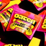
Oat Standing
A guest article written by packaging expert Lisa Cain. BP&O Voices presents the opinions of industry experts on a wide range of topics....
Goofy, playful and knowingly a bit silly
Design systems are often spoken about in terms of those moments of ‘surprise and delight’, but often, there’s little either surprising or delightful to be found. Blurr Bureau’s new brand identity for Yes! Apples, however, is so brimming with surprise and delight that those moments become the entire timeframe here: the Easter Eggs absolutely abound here, for the brand design...
An act of restitution
Caffè Nazionale is a historic bar on Piazza Libertà in Arzignano, a small city in Veneto, Italy, which was the social heart of the town – a place for conversation, card games, billiards, and the daily ritual of an espresso at the bar – for generations, before falling into closure and decline. Having first opened in the 1950s, the Caffè...
BP&O Voices
Packaging:
Built to Seduce
A guest article written by packaging expert Lisa Cain. BP&O Voices presents the opinions of industry experts on a wide range of topics....
Gloopy, bubbly, occasionally borderline illegible
It’s always confusing, surprising and slightly disappointing when you come across art or design-focused brands, agencies, platforms, publications or organisations that seem to have a total disregard for what they look like – as though their own central premise and raison d’etre is at odds with their look and feel. I won’t name names, because that feels both mean and...
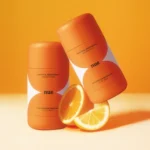
Feel the heat
Most branding has to give some suggestion of what said brand is, or does, or stands for – it’s usually not ideal if they bear little to no resemblance or representation of their category, audience or ideals. The exceptions are usually things like record covers, or other inherently creative entities like musical instruments, editorial projects; occasionally booze brands, like the...
BP&O Voices
Packaging:
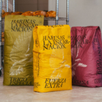
Flour, But Make It Sexy. And Big
A guest article written by packaging expert Lisa Cain. BP&O Voices presents the opinions of industry experts on a wide range of topics....
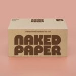
Diggin’ it
Just when you thought we were approaching a post-pet-parent era, a brand comes along and proves very much otherwise. Thankfully, though, while pet parenting seems to be alive and well; fingers crossed we’ve left behind the whole rather icky “fur baby” days of things like dog bandanas that read, “My Mom is Sooooo Obsessed with Me”; or dog nail varnish;...

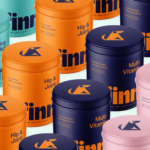
Equipped for Life
The protein market has absolutely boomed in recent years – a trend that doesn’t look as though it’s going away any time soon: a 2025 survey from the US-based International Food Information Council (IFIC) revealed that the most common diet that Americans followed in the past year was “high protein”, and that consumers use “good source of protein” as the...
BP&O Voices
Packaging:
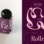
Roll with it
A guest article written by packaging expert Lisa Cain. BP&O Voices presents the opinions of industry experts on a wide range of topics....
Drizzle and Drama
I’ve never really thought about wedding venues needing a brand; but then again I’ve never really thought much about wedding venues at all – and neither is Chateau Engalin much like most other nuptials-centric sites. Recently bestowed with new brand design courtesy of Pentagram London partner Samar Maakaroun and her team, Chateau Engalin is based in the heart of the...
Gaming Goes Goblin-mode
Remember the heady days of 2022, as we emerged blinking into the light in a cautious post-pandemic haze – confused, slightly heavier, wondering whether we should cancel Disney+ now that going out was sort-of-possible? It was then that The Oxford Languages Word of the Year (well, two words if we’re being pedantic, which is surely an approach the famous dictionary-pedlars...
BP&O Voices
Packaging:
Brewed for Good
A guest article written by packaging expert Lisa Cain. BP&O Voices presents the opinions of industry experts on a wide range of topics....
Mix and Match
Ten or so years ago I’d wager that most of us hadn’t even heard of padel, but the tennis-adjacent pursuit has boomed in recent years: there’s reportedly a whopping 30 million padel players worldwide, as of stats from late 2024. Despite the fact the name sounds somewhat Ye Olde-ish – it wouldn’t be surprising to see a reference or two...
Dating Apps Go Full Cerca
It wasn’t too long ago that we were deluged by think pieces bemoaning the state of dating apps; detailing their fall-from-favour in data that showed in cold hard numbers that their popularity had long since boomed. The swipe-laden online dating world, it seems, was drastically waning. All sorts of theories flew around: maybe Gen Z – frequently (bafflingly, implausibly) lauded...
BP&O Voices
Packaging:
Cleaner Take On The Dirty Work
A guest article written by packaging expert Lisa Cain. BP&O Voices presents the opinions of industry experts on a wide range of topics....
HotDog by SMLXL
From the moment I turned the sound up (as per instructions) on the ‘about’ page of the HotDog website, safe to say I was obsessed with this brand and its branding. It’s laugh out loud hilarious – I truly loled, as did the person I was sharing a room with, and as I’m sure anyone within eye- or ear-shot would...
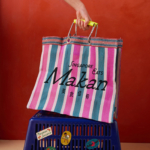
Yes we Makan
The chintzy rose; the bright but slightly dusky pink; the multifarious wordmarks; the apparently haphazard, painterly decorative flourishes; an approach to letter sizing that’s borderline unhinged – the branding for Makan has the potential to be all kinds of terrible. Instead, it’s absolutely the opposite, thanks to the deft hands at Foreign Policy (Park Bench Deli, Project Send, Critical Mass)....
BP&O Voices
Packaging:
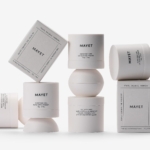
Space Craft
A guest article written by packaging expert Lisa Cain. BP&O Voices presents the opinions of industry experts on a wide range of topics....
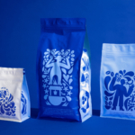
Storrd by Among Equals
London is awash with convenience stores – from the acrid yellow signage of Nisa to the misleadingly named ubiquity of Costcutter to the countless independents named things like Ben’s, despite the fact they have nothing to do with anybody called Ben. Such shops – reliably there at most times of day, reliably overpriced (hence the convenience I suppose, like an...