Snack Pot Packaging
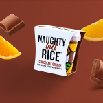
Naughty But Rice by Robot Food
Naughty But Rice is a rice pudding range created by The Hain Daniels Group in response to an increase in the dessert’s popularity in the United Kingdom. Unlike the product’s of established and mainstream brands, Naughty But Rice, as the name suggests, offers consumers a modern and indulgent twist on the traditional favourite, with flavours that include Coconut & Raspberry, Salted Caramel and Chocolate...
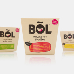
BOL by B&B Studio
BOL is a range of vegetable pots made from fresh natural ingredients using recipes inspired by local chefs and street market stalls from a variety of international destinations, packed and presented with a modern on-the-go convenience in mind. BOL was created by Paul Brown, the former general manager of Innocent’s food division, following the company’s exit from the category, and features...
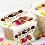
Cuckoo Muesli by B&B Studio
Cuckoo is a ‘modern’ wheat-free bircher muesli range that blends oats, yoghurt and fruit. Individual flavours include ‘Choco Sour Cherry with a smooth layer of Madagascan Vanilla’, Mango & Coconut with a tropical twist of Lime and Ginger’ and ‘Elderflower & Cranberry with a Blueberry & Blackcurrant compote’. London-based design agency B&B Studio, inspired by Swiss graphic posters, developed a new...
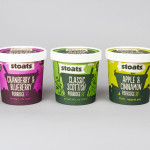
Stoats Porridge by Robot Food
Stoats is a Scottish oats company that began life in 2005 as a converted American hot dog sales stand serving porridge at summer music festivals around the UK, and now has a range of packed, ready to eat retail products that include flavoured porridge and porridge bars. Stoats recently commissioned Leeds-based independent design studio Robot Food, as part of a complete rebranding exercise,...