Los Italianos by Huaman
Los Italianos is a traditional Italian food producer and retailer with three locations across Barcelona but with its roots in the Piemonte region of Italy and a significant history that dates back to 1939. Los Italianos recently commissioned Spanish design studio Huaman to develop a new brand identity that would better position them within the gourmet category, introduce an elegance and modernity...

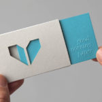
Numbered by Martín Azúa by P.A.R
Numbered is a range of handcrafted home-ware products and individual commissions, created by Basque product, space and graphic designer Martín Azúa, that explore the relationship between functionality, emotion and conceptual thinking, and blur the line between tradition and innovation. A limited and controlled production context, personalisation and a connection to the local environment bring further value to each object and influence their...
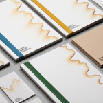
Jeremy Maxwell Wintrebert by Hey
Jeremy Maxwell Wintrebert is a glassware designer and manufacturer currently working in France with a free hand glass blowing philosophy mastered while traveling internationally across the US and Europe. Spanish design agency Hey recently developed a new visual identity solution for Jeremy that captures the heat, craft and art of glass blowing through a smart combination of colour and laser...
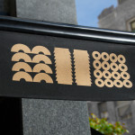
Minke by Atipo
Minke is a Spanish print production studio that favours ‘analogue splendour’ over mass manufacture, providing its clients with a variety of small-scale, mechanical and handcrafted processes. Their visual identity, developed by multidisciplinary design studio Atipo, reflects these services, processes and philosophy through a union of traditional and contemporary detail that exists across type, colour, material texture, print finish, pattern and die cut...