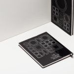
Stencil
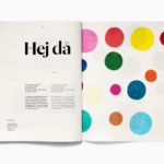
Essem Design Product Catalogue 2018 by Bedow
In 2014 Bedow worked with Essem Design, a Swedish manufacturer of artisanal hallway products and furniture, to develop a new graphic identity. This included logotype, adverts, catalogue, product sheet and stationery design. The concept was based around the simple gesture “Hej—Hej då”, hello and goodbye in Swedish and a reference to the most common phrase used in the hallway. This verbal...
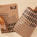
H+J by Spy
H+J is a UK independent catering business, established in 2004, that has provided food and catering solutions to venues such as The Cutty Sark, Moët & Chandon, Abbey Road, RIBA and Selfridges. Their services include working lunches and private dining rooms, large scale food courts, cafes and deli bars. London-based graphic design studio Spy worked with H+J to develop a new brand identity that would...

Croxley Park by Blast
Croxley Park is a business park located two miles from the town of Watford, United Kingdom, with good local public transport links and twelve minutes from the M25, an arterial route that encircles Greater London. Although strategically placed to make the most of these networks, Croxely Park also has a unique 25 acre parkland setting. Currently, this is home to both multi-national companies and...

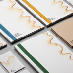
OpenView by Pentagram
OpenView is a Boston-based business dedicated to investing in and helping to grow what are described as expansion-stage companies that are working in the software development sector. OpenView has a unique hands-on approach, and worked with Pentagram’s Natasha Jen to express this through positioning, tone of voice and visual identity design. This included custom typography, stationery, business cards, website and...
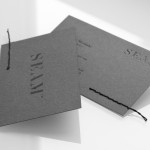
Seam by For Brands
Polish design agency For Brands were recently commissioned to create a new visual identity for Seam, a distributor of luxury clothing brands, that would convey a sense of craftsmanship and an eye for detail. For Brands mixes classic typographic detail with contemporary customisation delivered across tactile material choices with hand finished detail, fusing urban, craft and fashion sensibilities....
Jeremy Maxwell Wintrebert by Hey
Jeremy Maxwell Wintrebert is a glassware designer and manufacturer currently working in France with a free hand glass blowing philosophy mastered while traveling internationally across the US and Europe. Spanish design agency Hey recently developed a new visual identity solution for Jeremy that captures the heat, craft and art of glass blowing through a smart combination of colour and laser...

Smets by Coast
SMETS is a luxury department store located in the heart of Brussels (with two more locations across Luxembourg) with over 3.500 square metres of fashion, design, art, food and beauty. Following last December’s BP&O review of the SMETS identity, independent design agency Coast has recently published some further images outlining how this new visual identity has been executed across a wider variety of collaterals and touch-points....
The Lollipop Shoppe by Studio Makgill
Established in 2007 The Lollipop Shoppe is a contemporary retailer designer furniture and accessories located in Brighton, UK. With its own range in development and another store set for London they challenged Studio Makgill to develop an identity that could reflect their growing ambitions, convey a straightforward business nature and unify the shop’s modern and classic product ranges....