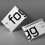
Fogg by Bunch & Kurppa Hosk
By purchasing overcapacity from international telecom networks, Fogg Mobile provides a fixed cost mobile data traffic service for people who want to avoid unexpected roaming bills when travelling abroad. Through the animate and evolving qualities of computer generated imagery and a combination of unbleached paper, stitching, flat coated colour and silver polypropylene, Fogg’s visual identity, created by Kurppa Hosk and developed by Bunch, delivers...
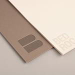
Bedroc by Perky Bros
Bedroc is a Tennessee-based consultancy firm that takes complex business issues and simplifies them with technology to reduce risk, optimise efficiency and creating revenue for its clients (ROC). The firm’s visual identity, created by multidisciplinary design agency Perky Bros, avoids the conventions of the industry and instead favours a direction that draws an analogy between bedrock and technology—the physical stability, sub-surface...
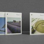
ITI Computers and Diventa by Bunch
ITI Computers is a Croatian-based software company that specialises in the development of IT solutions for the leisure, tourism and hospitality sectors. Bound by a consistent typographic and monogrammatic design solution but divided by an organic and systematic contrast of context, creative agency Bunch developed a new logo and print solution for ITI and its leading management product Diventa, which delivers an interesting richness...
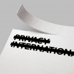
Privacy International by Paul Belford Ltd.
Privacy International is a UK based non-profit organisation established in 1990 to monitor the security intrusions of governments and business, increase the awareness of data protection concerns and establish ‘new forms of privacy advocacy’ at an international level. Made up of computer professionals, academics, lawyers, journalists and human rights campaigners the organisation has worked on initiatives across fifty countries and is...
Great British Chefs by Hat-trick
Great British Chefs is an application that gives its users access to videos, cooking tips and shopping lists from a range of customisable menus built from over 180 dishes created by twelve of Britain’s top chefs. The apps identity, designed by London based studio Hat-trick is a series of ‘C’ shaped logo-marks created from kitchen implements that resolve the ideas of...
Google Chrome by Office
Google has started rolling out a new version of their logo designed by Office. This is a significant improvement, gone are the superfluous effects, in a favour of a flatter, but still dynamic logo that is better-suited to increasingly diverse use-cases such as a flat mark laser etched on to hardware. “As the world’s most popular Internet browser, Chrome has...