Danish Selection by Kontrapunkt, Denmark
Posted: Filed under: Food and Drink, Packaging Reviews | Tags: Best Packaging Designs, Colour in Use: Pastels, Creative Packaging, Design For Print, Design Opinion, Design Reviews, Designed by Kontrapunkt, Designed in Copenhagen, Designed in Denmark, Fonts by Hoefler & Co., Fonts in Use: Brandon, Fonts in Use: Knockout, Fonts in Use: Thirsty Script, Food Packaging, From Scandinavia, Graphic Design, Graphic Design Blog, Jam Packaging, Numbers In Branding, Packaging Company, Packaging Design, Packaging Design Blog, Packaging News, Pastel Coloured Papers, Spot Colours, The Best Packaging of 2016, The Very Best of 2016, Typography, Uncoated Papers & Cards Comments Off on Danish Selection by Kontrapunkt, DenmarkOpinion by Richard Baird.
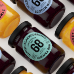
Danish Selection is a new range of high-quality fruit spreads cut with alcohol. The range includes blackcurrant infused with Jamaican rum, orange with cognac and a wild blueberry variety with Scotch whiskey. Orkla, the company behind Danish Selection, worked with Copenhagen based graphic design studio Kontrapunkt to develop a packaging treatment that would clearly communicate this new concept to consumers. Kontrapunkt’s solution is characterised by a circular label of type, pastel colour and uncoated paper.