Designed by Toko
Cult 20 Years, Event & Exhibition by Toko
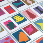
In 2017 Australian furniture retailer Cult celebrated its 20th anniversary. They marked this with an event and exhibition and worked with design studio Toko to develop a graphic identity to unify these and bring to light their extensive catalogue. Through a mix of bright illustrative silhouettes across invitations, packaging, postcards, flags and banners, the art direction of some Cult’s ranges, and...

Architects Accreditation Council of Australia by Toko
Architects Accreditation Council of Australia (AACA) is the national voice for architect registration boards around Australia. The council runs the Architectural Practice Examination, assess overseas qualifications, collates data on the profession throughout the country, facilitates international mutual recognition agreements and provides alternative pathways to registration for local practitioners and architects from overseas. The AACA worked with Sydney-based studio Toko to clarify the complexity...

NAU by Toko
NAU is a new Australian furniture brand created by the premium designer furniture and lighting retailer Cult, and features work by futurist designer Gavin Harris and Adam Goodrum, a designer that believes an object justifies its existence through story and detail. Design by Toko worked with Cult to develop name, and create a logo and graphic identity for NAU that...

Maven by Design By Toko
Maven is described by Design By Toko, the Sydney-based design studio behind its recent rebranding, as a top-tier architecture recruitment agency operating worldwide. Drawing on the built environment and with the intention of expressing the agency’s prominence within the architecture industry Toko developed a brand identity of simplicity and impact through bold solid form and single colour that links business...
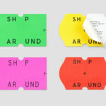
ShopAround by Design by Toko
ShopAround is described as a creative supermarket, however, in more conventional terms, began as an artist representation agency in 1998. It has grown, since then, to become a creative production agency specialising in contemporary illustration, graphic design, animation, motion graphics and interactive design. ShopAround co-ordinates a network of over 80 international freelance designers, and fosters new creative talent from its offices in New York, Amsterdam...

East Sydney Early Learning Centre by Toko
East Sydney Early Learning & Community Centre is a state of the art space located on Bourke Street. It provides childcare places for parents living or working in the inner city suburbs of Sydney. The centre, designed by ABA Architects, features five play rooms set over three levels, indoor playground on each floor and an open-air play area on the top floor. The space...
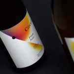
Black Estate — Circuit by Toko
Circuit is a 2014 Pinot Noir and 2015 Pinot Gris range from New Zealand’s Black Estate, a Vineyard run by The Naish Family and located across three hillsides in the Waipara Valley, an area of North Canterbury with clay and clay-limestone soil. Black Estate worked with Australian graphic design studio Toko on the branding and packaging of these two new wine varieties...