Water Packaging
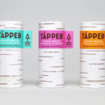
Tapped Birch Water by Horse
Tapped is an organic birch water, drawn straight from trees growing in Finland, and available in Bilberry & Lingonberry, Apple & Root Ginger and unflavoured varieties in the UK from Whole Foods Market, Planet Organic and online. Birch water is a traditional spring time drink and medicinal ingredient in Finland, tapped from birch trees which filter ground water up through their roots and trunk...
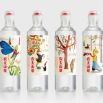
Nongfu Spring Mineral Water by Horse
Nongfu Spring is a bottled mineral water brand and a leading Chinese beverage business. Nongfu worked with British design studio Horse to develop a new package design treatment that, using labels illustrated by designer Brett Ryder and a distinctive structural design with a slim profile and proprietary leak-free sports cap, would engage the youth market....
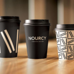
Nourcy by lg2boutique
Nourcy is a delicatessen that has been creating fresh, home-made and original products for thirty years from its location in Quebec City. While providing a contemporary dining environment Nourcy also offers catering services and lunch boxes to customers who have come to expect restaurant-quality at work and at home. In conjunction with a new menu of pastries, an expanded chocolate selection, exclusive gourmet delicacies and the development of a...