Acer
Opinion by Richard Baird Posted 11 April 2011

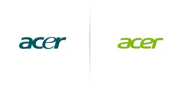
Acer is a Chinese manufacturer of computer components and peripherals, originally developing low end products it has moved its position to focus more on the middle market and the exportation of its own range internationally. Recently they underwent a restructuring with the chairman Gianfranco Lanci resigning and replaced by JT Wang who has started his new position with a review of the company’s corporate logo.
“In Acer’s 35-year history, we have changed our corporate logo several times. Each time, it was to face new challenges in a different stage of our development. The last time was in 2001, when we spun-off our contract manufacturing business to focus on our brand business…” – Acer
The original typeface had an awkward balance of letter weights and spacing, it felt poorly constructed and didn’t represent their commitment to delivering value. The new word-mark essentially fixes everything that was wrong with the original, it is more modern has equal weight throughout the letter-forms each leaning forward in a measured and balanced way. The dark green has been replaced with a lighter lime tone giving it a more youthful presence albeit a bit trendy for a long term identity.


