Richard Baird
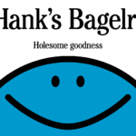
Hank’s Bagelry by Studio Ongarato
Sometimes, a brand identity can be deeply strategic, have a rich heritage or an involving narrative. Other times, it can be simply eye catching and cool. Suites of custom designed icons, art directed photography, tone of voice, motion behaviours, programmatic graphic elements and bespoke in-house content generating tools…. not every brand needs these. They’re colours to paint with. I call...
Muse Group by Collins
Muse Group exists as a collection of digital products covering all aspects of the creative process in music. This reviewer is familiar with Audacity and has used it in the past, but other platforms include Ultimate Guitar, MuseClass, MuseScore, and MuseHub. These tools are used by a range of professional musicians, budding amateurs, and everyone in between, working across all...
Sigma by Stockholm Design Lab
You could argue that there’s a fair few similarities in terms of Japan and Sweden’s approach to design, and the aesthetics of life more generally. Both are known often for a specific kind of minimalism – a tastefulness that eschews fluff, luxuriates in crisp whites and keeps its edges, everything in its right place, rules and order and form following...
Teller by Werklig
The social and cultural activity of sharing stories has been, and continues to be, an essential part of human experience. Storytelling contributes to the cohesion of, and sometimes control over, individuals and groups, preserving and passing on knowledge, and instilling moral values. Many of us live by the values and knowledge established over thousands of years through stories. With improvisation...
Something a Wittl different
Hi! It’s Rich here, you’ll have to forgive me, this is a rare one-off message to the studio owners (and soon-to-launch studios) that follow BP&O. I wanted to introduce you to something that I’ve been working on over the last year, something that I think you might find useful. My co-founder Christian and I found a gap in the market...
Siuru by Bond
Estonia’s Siuru plays with important questions, subverting and, at the same time, fulfilling expectations. Is it an art museum? A library? A cinema? Or a cultural institution? For a Bond (Veikkausliiga, Saaristo, Cable Factory) the design studio in charge of developing a brand identity for Siuru, this raised the concern, how do you brand something that seeks not to be characterised...
Ding by Wildish & Co.
When I left the UK and landed in the Czech Republic – my home between 2010 and 2018 – I found a notable difference in advertising and branding between the two countries. Specifically, I saw an abundance of brand mascots. Now, of course, mascots were also used in the UK and have a global historical precedent, but I was struck...
Veikkausliiga by Bond
How do you bring the fans, teams, and stadiums of the northernmost league together under a shared identity that captures the energy and passion that defines it? For Bond (Saaristo, Cable Factory & Northstar Film Alliance), the answer was in plain sight… the scarf – strewn across the terraces, held high, no matter the team or the weather. Veikkausliiga is...
Ambassaden by Bleed
Designed by Finnish-American architect Eero Saarinen, the Ambassaden’s angular modernist stature holds a striking presence in the heart of Oslo. When it opened in 1959, it functioned as the US embassy until its closure in the early 2000s. Fast-forward to today – the building has been reopened and its programming altered. It now operates as a multi-functional space that includes...
TwelveLabs by Pentagram
Remember when the conversation around gradients was about making ‘bad’ design look ‘better’? When RGB colours were frowned upon because you couldn’t print them? Yeah, those ideas feel a bit outdated now. HP Indigo can now run fluorescents affordably, and business card mock-ups (in RGB) are more about selling than printing. Technology marches on, expectations and standards evolve, and everything...
Ten by Paul Belford Ltd
I’ve been writing about the work of Paul Belford Ltd. (Next Chapter, Spudos & Social Enterprise) for very nearly fifteen years. Initially, and admittedly, the articles practically wrote themselves, which was ideal for a self-taught designer with very little experience but keen to take an approach to learning that was very much my own. That was to write about a...
Hip Pop by Robot Food
Running a design blog sharpens your eye for category conventions. Stick with it long enough, though, and you’ll start to see those conventions unravel. What once felt fixed begins to flex. This creates a challenge for writing about design: you’re constantly assessing the landscape, but that landscape is always shifting. Take minimalism, for example. Once the dominant aesthetic of the...