Glue Dots
Opinion by Richard Baird Posted 17 April 2011

Glue dots is a brand of double sided adhesives that can be applied to a variety of surfaces and generally used for craft based projects. Owned by Glue Dots International based in New Berlin, Wisconsin, the product originally launched in 1995 has recently undergone its first re-brand that will extend across all its packaging and on-line touch points aimed at reinforcing its position as the “everyday adhesive”.
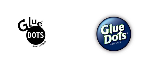
The original logo was a simple black and white construction of type around a circle with a very literal sensibility, it suffered from poor mixed typographical choices and an unbalanced lock-up. The overall identity system based around colours and typography looked basic and didn’t stand up well against the more established products such as Pritt Stick which has a more resolved brand message. In contrast the new logo is a significant improvement and looks far more professional. The circle is retained from the original logo-mark and now contains the typography which is consistent (albeit a little tight in places), well proportioned with a strong forward movement that sufficiently represents the product’s ease of use. The ‘adhesives’ type treatment is too light and doesn’t display well on their website and while the effects are a little much they work well on the revamped colour coded packaging.


