Great British Chefs by Hat-trick
Opinion by Richard Baird Posted 15 July 2011
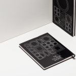
Great British Chefs is an application that gives its users access to videos, cooking tips and shopping lists from a range of customisable menus built from over 180 dishes created by twelve of Britain’s top chefs. The apps identity, designed by London based studio Hat-trick is a series of ‘C’ shaped logo-marks created from kitchen implements that resolve the ideas of simplicity, speed, collaboration and accessibility.
The logo-mark is a neat idea that has a straightforward and identifiable relevance that is well executed. The individual components of the mark subtly express the collaborative nature of the twelve chefs and the variety of available content. Animated the concept works well to reinforce the themes of quick and easy through its clock face reference while its circular form alludes to the idea of universal accessibility, the small contraction at the end is a really nice touch and shows a real attention to detail. The typography is simple albeit a little familiar and while the ‘EA’ and ‘HE’ ligatures endeavours to add a bit of character appear awkward and unnecessary. The black and white palette has a modern and simple feel to it that delivers a content focused aesthetic with a high quality and broadcast sensibility. The real highlight, and what really brings the idea to life, is the cover of the book.