Packaging: Emmi Yoghurt

Emmi Yoghurt Designed by Sarah Box

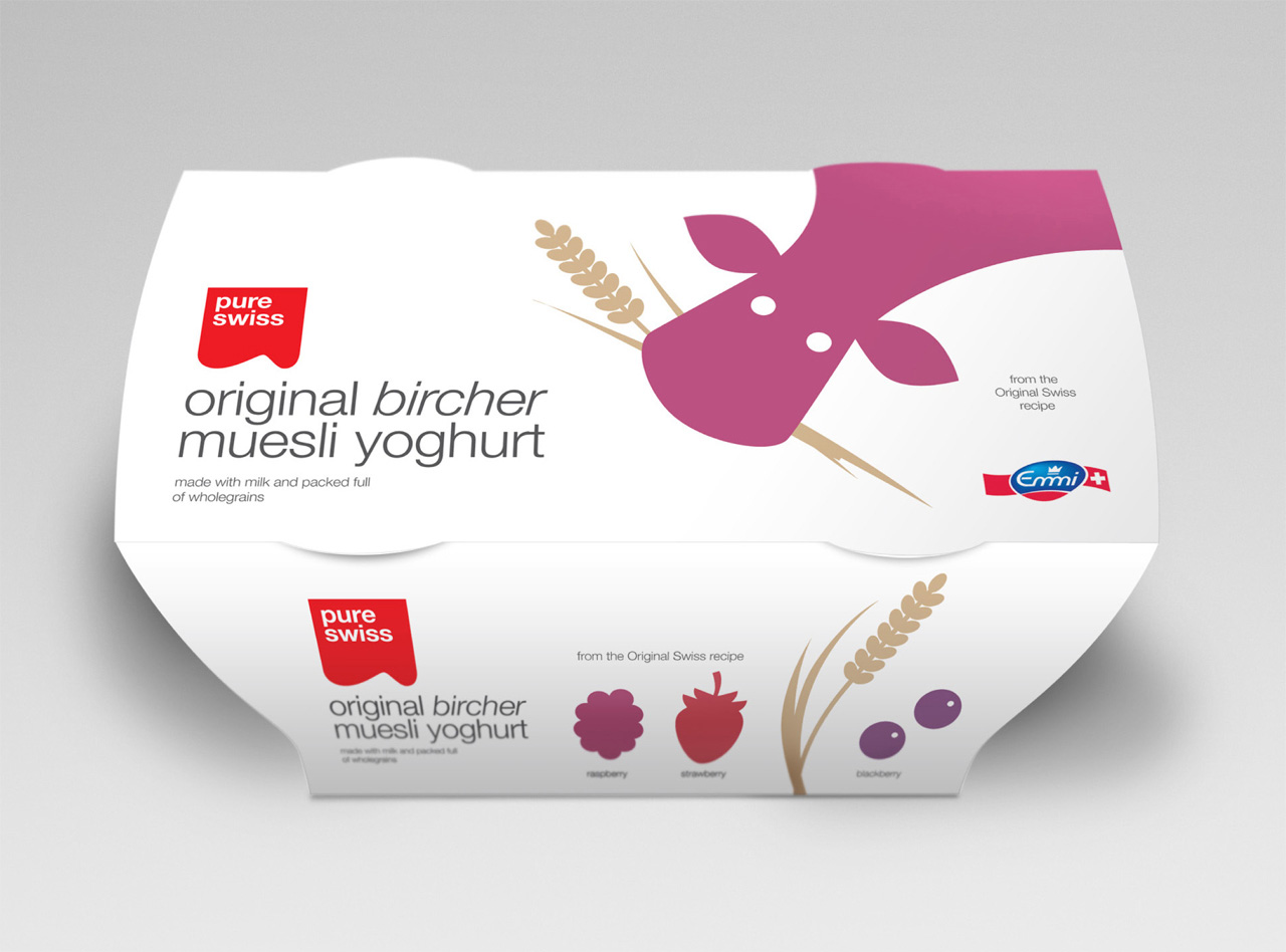
Swiss Plus is a range of yoghurt products from manufacturer Emmi. As part of a re-brand, London based Studio H created a new simpler packaging solution that avoids the usual clichés and utilises a straightforward illustrative style for the UK market.

This has a very clear, confident and restrained aesthetic that draws attention through its simplicity with an honest, wholesome and childlike innocence that captures the natural aspect of the ingredients. Each illustration is nicely rendered and consistent while the colour palette feels natural and suitable for the theme. The cow is simple in its execution with a wide-eyed character that stands out well on the white background and should look great in the refrigerators. The stacked and cluttered nature of the branding is a little bit of a let down but the typographical choice and layout below help to balance this out and contrasts with the quirky style.

Emmi Yoghurt Designed by Sarah BoxEmmi Yoghurt Designed by Sarah Box

UPDATE 03/08/11

Images of this project have been updated on the Studio H website which now show a revised design that addresses the cluttered nature of the logo application, the packaging now features the improved brand work and appears far more resolved.

Emmi Yoghurt Designed by Studio H


3 Comments on “Packaging: Emmi Yoghurt”

  1. corfen-dorfen says:

    nice graphic

  2. The reference to the mountain range (that clutters the main logo) on the tab on the poster is a really nice touch. Cool cow!


Leave a Reply

Fill in your details below or click an icon to log in:

WordPress.com Logo

You are commenting using your WordPress.com account. Log Out / Change )

Twitter picture

You are commenting using your Twitter account. Log Out / Change )

Facebook photo

You are commenting using your Facebook account. Log Out / Change )

Connecting to %s

Follow

Get every new post delivered to your Inbox.

Join 2,828 other followers