Logo and Branding: MTLL
Posted: August 8, 2011 Filed under: Architecture & The Built Environment, Logos & Branding | Tags: anagrama, architecture, Art, branding, business cards, construction, design, identity, logo, logo news, Mexico, MTLL, review, stationary, urban landscaping 4 Comments »
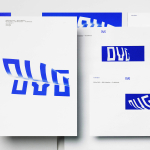
MTLL is a new architectural and urban landscaping firm established by Miriam Torres and Luis Loya. Their new identity, created by brand development agency Anagrama, revolves around a simple initials based logo-type that mixes utilitarian, architectural and spatial abstractions to characterise the vast and combined knowledge of its founders.
“We developed a typographic logotype in which the firm’s initials were as reduced as possible to convey the constant search of simplicity and pragmatism.”
“The typography’s traces are very robust in order to give the brand strength. However, they contrast with the serif’s fine details making the logotype much more legible, giving it a very distinctive personality.”
- Taken from the Anagrama website
I have a particular interest in architectural identities, it is a discipline that is inherently rich in visual and conceptual ideas that provides a multitude of angles to work from. In this instance Anagrama’s pragmatic direction of stripped down and bold letterforms clearly alludes to the idea of construction at an elemental and functional level. The missing main stroke of the ‘M’ and absent left crossbar of the T reinforces this very minimal tone while adding a subtle sense of depth and orthographic perspective. Its application across the collaterals is very neat and simple combined with an interesting and consistent grid based layout and typographical structure. The single colour reinforces the tone of the logo-mark but is slightly compromised by the superfluous red edging detail on the business cards.
Overall the MTLL logo-type manages to draw together aspects of functionality, practicality, space and relevance in a simple and what I feel is a timeless and minimal form. It encourages the viewer to look at both the positive and negative space and suitably analogises the inner and outer spaces of the built environment.
Visit the BP&O Logo Gallery for a chronological guide to all the identities reviewed on BP&O.


More from Anagrama:


There appears to be an inconsistency in application. Sometimes the diagonal stroke on the M is apparent, sometimes it is not. With the stroke visible, it’s easy to read the marque as MTLL. Without it, I’m in the VITLL camp. This inconsistency is disappointing for an identity that appears to be glorifying the details of its own construction.
I think it was Erik Spiekermann who said something like, “You only need two colours, black and red”. I don’t personally agree, but it is a classic combination. I think the edge detail on the cards communicates something about the organisation’s attention to detail and respect for craftsmanship. If it was the only place where red appeared I might join you in thinking it superfluous, but it also appears in the name on a business card, the ink of the rubber stamp and the legal style closure mechanism on the document cover – again a demonstration of detail focus and celebration of craftsmanship.
Chopping bits off Didot or Bodoni-esque serif faces is hardly revolutionary – Pentagram have made career out of it and Fabien Baron played beautiful typographical games with Firmin Didot un the 80s – but it does lend itself to communicating a refined classical modernism (note that is modernism with a lowercase m) with consumate grace – especially when combined with some sans type and a clean, obvious grid.
Shame about the inconsistent diagonal.
Hi Shaughn, thanks for the comment, I do feel myself being pulled towards your point of view. I must admit I am a little embarrassed I missed the inconsistent application, I think that with such a minimal identity including or not including the diagonal stroke makes a big difference visually and conceptually. Hopefully Anagrama will read the article and reply.
I sent Anagrama a message on Facebook regarding the diagonal ‘m’ detail and asked if it was on purpose, they replied “It is on purpose. The logotype may include the link depending on the size to improve legibility.”
That reply from Anagrama doesn’t tie with the images here either. The diagonal stroke seems to be applied at a variety of sizes, just as the version without is.