BRR by BRR
Opinion by Richard Baird Posted 11 August 2011

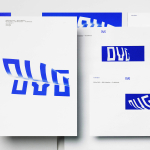
Brian R Richards (BRR) is a brand strategy and design firm based in Auckland, New Zealand. Their identity, a triple letter monogram, is part of a complete and bespoke typeface solution that explores the ideas of reductionism and the balance between type, form and shape.
I was recently asked to publish more type-based identities and I think this is a solid example and a recent finalist of the Best Awards. The BRR logo-mark, built from the modernist abstraction of characters, seems to move between two and three dimensional forms creating depth and duality while the overlays and transparent execution draws together the ideas of integration and collaboration. The typeface, the foundation of the identity system, is neatly utilised to create further monograms for the BRR employees and essentially constructs a brand suite with people at the heart. The colour highlights add a touch of contrast against the restraint of the grey and build on its simple and modernist aesthetic.