Riverside Museum by Marque
Opinion by Richard Baird Posted 18 August 2011
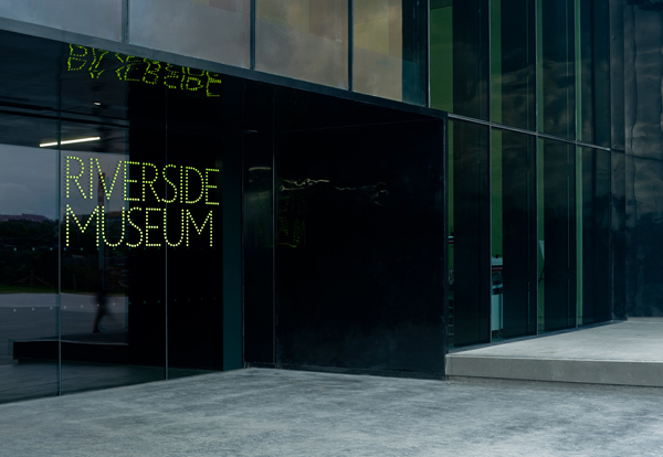
Built on the banks of the River Clyde, Glasgow, the Riverside Museum is Scotland’s must visit transport attraction and houses a vast collection of relics from a rich industrial past. The building, designed by world renowned architect Zaha Hadid, and the identity system, created by the now defunct international design agency Marque, were developed in tangent and form a flexible, dynamic and easily navigable space.
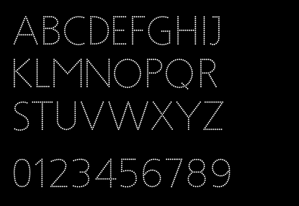
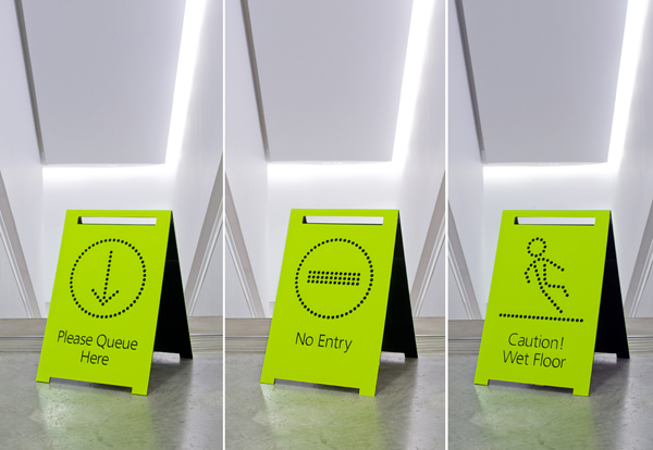
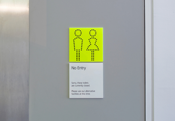
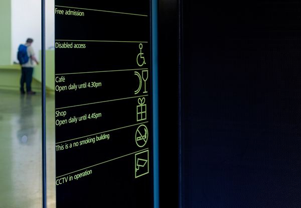
Inspired by “the visual language of the architecture that includes dot matrix, extruded forms and orthogonal finishing” the logo-type is not in itself massively unique but for me this is a wonderful example of consistent brand communication, unlike many other identities the logo-type plays only a small part within the overall visual language of the experience. There is a distinct travel association with dot matrix screens that suitably ties together most forms of transport and while it doesn’t necessarily capture the history it certainly compliments the museums very modern aesthetic. The dots of the logo-type, bespoke typeface and icons are just the right proportion and tight enough to create distinctive letter-forms and clearly identifiable graphics. The bold green and black colour palette contrast against the grey interior space and works well across a number of applications, the warning signs are a particularly effective idea and retain much of the brand style while being functional.
