Logo and Branding: MCK Architects
Posted: September 6, 2011 Filed under: Architecture & The Built Environment, Logos & Branding | Tags: architecture, Art, branding, classic, design, form, function, geometric, identity, logo, review, Sydney, There 7 Comments »MCK Architects is an award winning Sydney based architectural firm that specialises in high quality, high finish residential and commercial projects. Their new identity, developed by brand communication and environment agency There, blends the classic proportional and distinctive geometric aesthetic of MCK’s buildings with their collaborative work-style. The agency also created the accompanying printed collaterals, office signage and website.
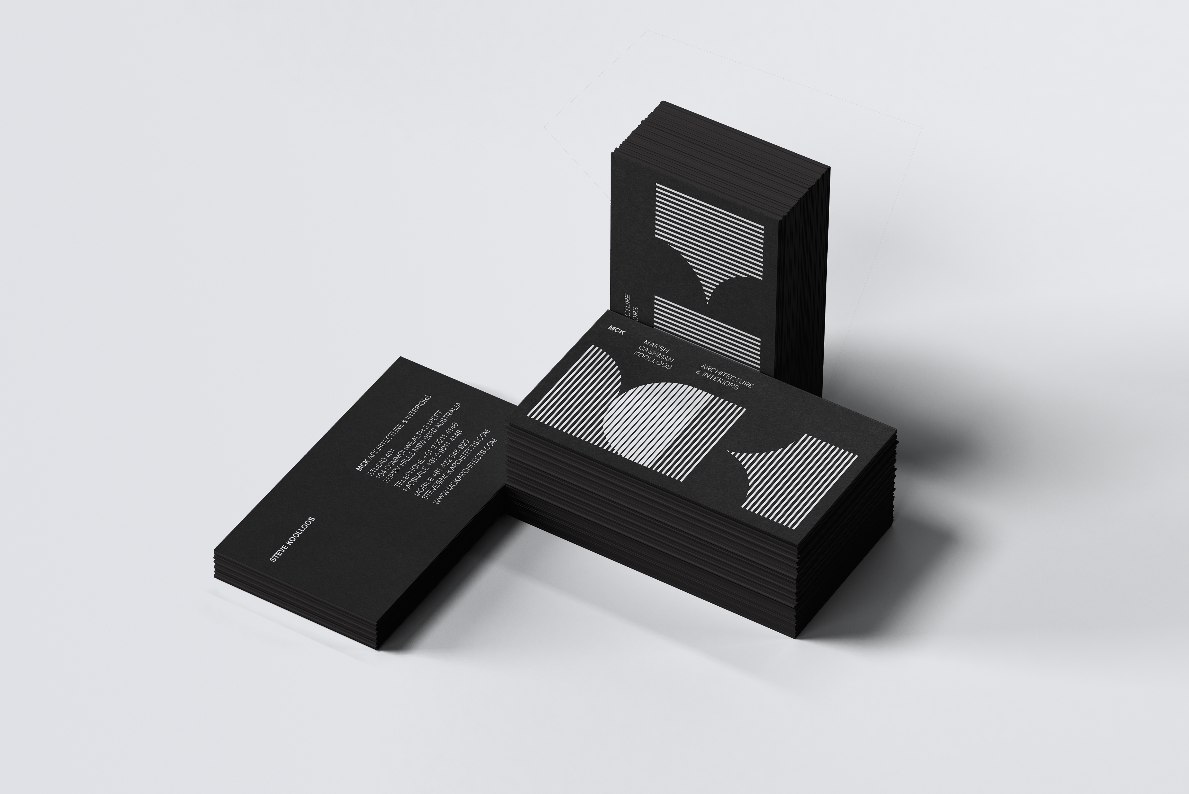
There are two very interesting but juxtaposing layers to this identity that neatly draw together the core ideas of MCK. The first is the reduction of the letter-forms to their most elemental characteristics tying uniting the ideas of geometry and fundamental, architectural design principles. The second (and in contrast) is the fine line treatment utilised to form and emphasise the letter C through the convergence of the M and K. This creates both a suitable representation of the high quality and detailed nature of their work while placing collaboration at the heart of their identity. The use of negative space (fairly common in architectural logo-marks) to form the K clearly articulates the firm’s understanding of physical structure and interior space which on closer inspection cleverly draws the eye down a curved corridor.
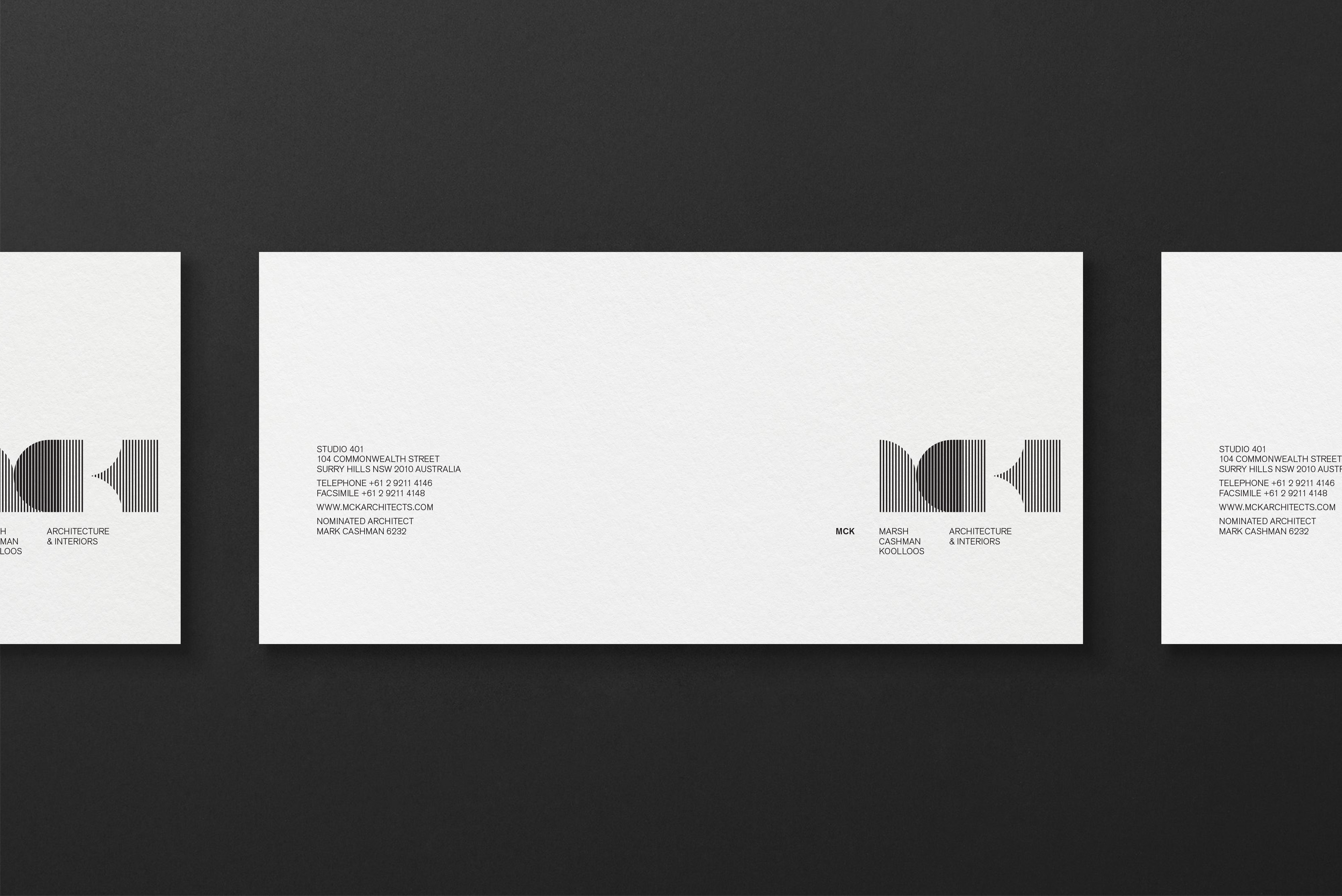
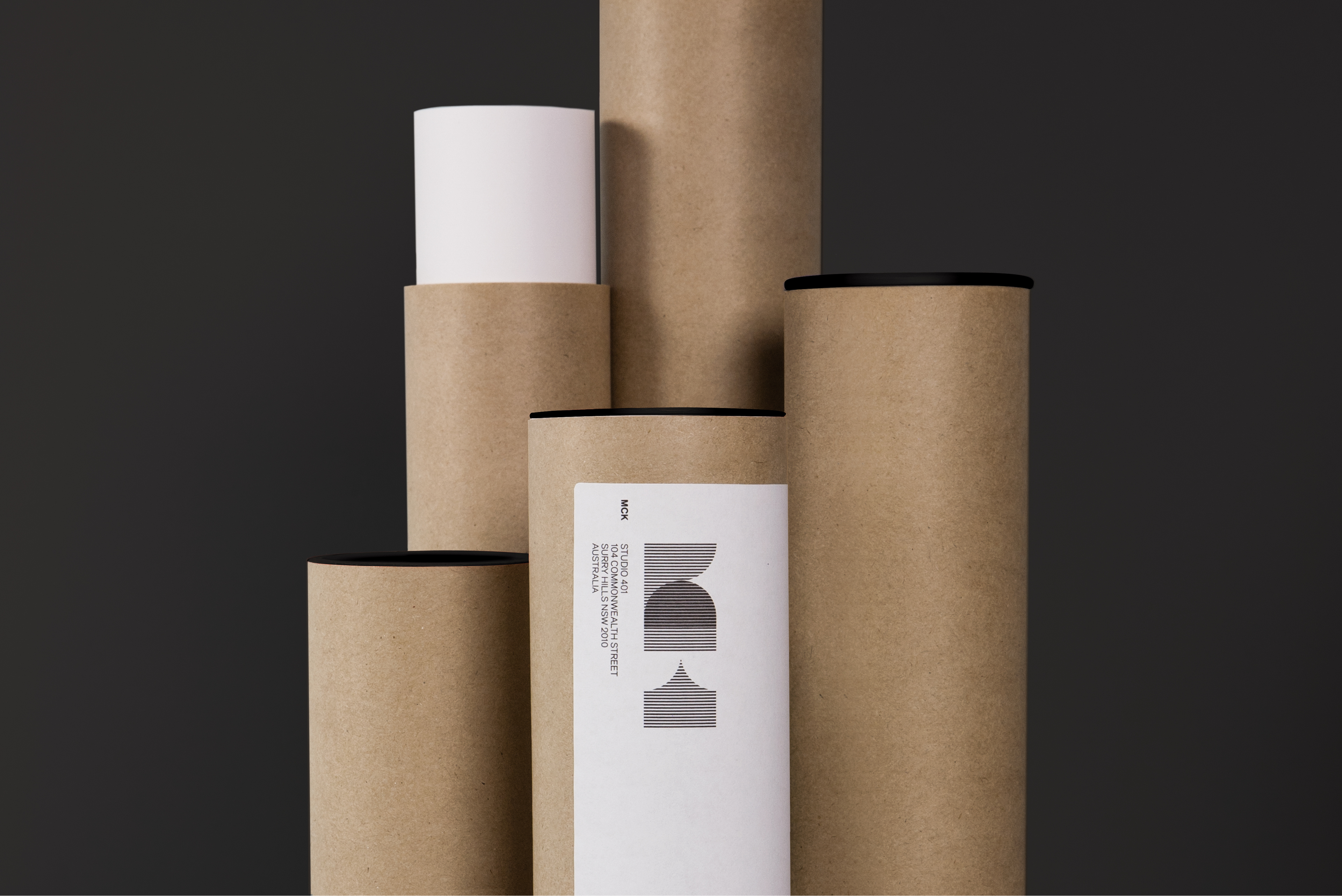
The application of the identity across the printed collaterals is bold and plays to the structural qualities of the mark leaving the type and layout to a minimal supporting role while the black and white colour palette continues the classic design theme.
Visit the BP&O Logo Gallery for a chronological guide to all the identities reviewed on BP&O.


Thank you to Paul Taboure for the images.


I think most people would have a little bit of a hard time to figure out what the logo actually reads, as it isn’t obvious for everyone. But it instantly says architecture for sure. Besides, I’ve seen There’s work a few times before, and I’m certainly a fan of their highly clever and contemporary design.
Morning Gert, that’s a fair point and agree. It isn’t immediately recognisable and all the references aren’t going to be understood by everyone but each component combined does equate to an architectural identity. The underlying elements probably play well to a design educated audience and clients of high-end services.
Amazing work bro …… always wowed
Being able to immediately read and understand a logo is overrated in my opinion. I’m never sure why people bring that up in discussions about branding. As long as the mark has it’s own unique character and is used wisely, it will become recognisable in it’s own right. That is FAR more important.
This one works for me.
Thanks for the comment Steve, it’s an interesting debate. Most identities will be perceived in different ways depending on their background, for the casusal viewer this will just say ‘architecture’ (which of course is the point) but for designers it expresses a lot more. I think it’s important to have some subsurface elements to show that the company isn’t about superficiality but has depth and an understanding of the service it sells.
Absolutely, that depth of meaning within a mark should definitely be strived for. Although it’s not always possible on a smaller budget and with a less understanding client. It’s very limiting to say a logo must immediately convey exactly what a business does – do the Golden Arches shout ‘fast food’? No. I wouldn’t imagine that this logo comes across as ‘architecture’ to a casual viewer – it could also work for an electronica record label for instance – but it certainly says that in it’s hidden meanings.
I agree that it is hard to see what it means but it does shout out Architecture-Design and I love it. It shows that a good logo branding doesn’t always need to convey what the business does. If anything it made me take notice and curious what it did do as I liked the design so much. To me a lot of great logo’s don’t convey the business at all but they do make you wonder and I think that half the constant battle in marketing.