Willow Water by Kirsty Mcmaster
Opinion by Richard Baird Posted 21 December 2011
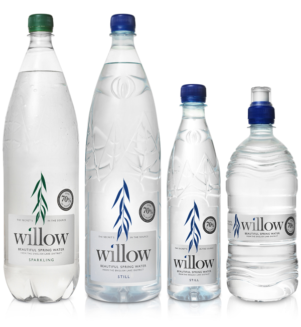
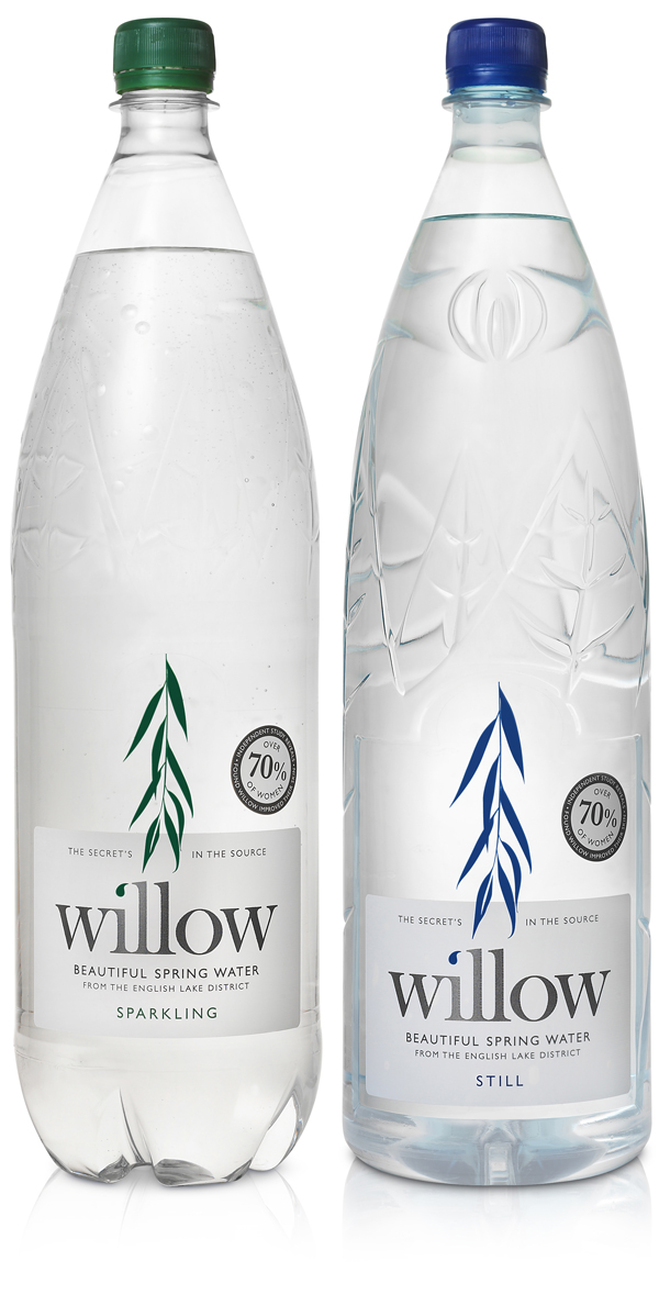
Willow is a brand of spring water sourced and bottled in the English Lake District. Following its recent acquisition by entrepreneur John Halewood and in lou of a fresh marketing push, the brand received a new packaging and brand treatment managed by Manchester based freelance designer Kirsty Mcmaster to better represent the quality, unique characteristics and origin of the water.
“We are re-launching the range with revitalised branding and packaging that highlights the purity of our water source and reflects our Cumbrian roots. The packaging also makes clear to consumers the full benefits of Willow Water with its unique blend of naturally occurring minerals, including Calcium and Salicin.” – Neill Cotton, Managing Director at Willow, from the Talking Retail website
“The extraordinary mineral contents make Willow Spring Water stands in a class of its own, proclaimed as the only water in the world containing the natural nutrient of Salicin, which has been known to reduce inflammation, noticeably skin disorders such as eczema and psoriasis since 5th century BC by Greek Physician Hippocrates.” – Alive Asia
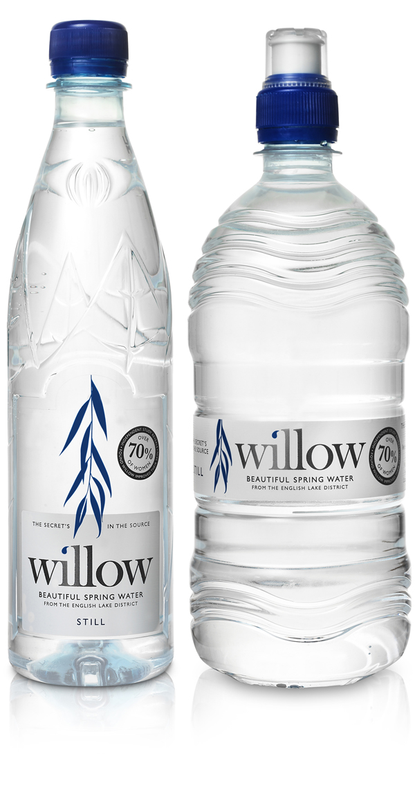
The brand’s name, taken from the spring’s location in a once white willow forest (from which the water now passes through as a peat layer) has been suitably captured with a simple but well crafted illustration that fuses the visual representations of fresh flowing water and willow leaves neatly characterising the water’s freshness and unique origin.
The logo-types spacing and construction is competent with the ligatures of the ‘i-l-l’ across the baseline being particularly well handled. The water droplet over the ‘i’ is perhaps a detail too far within the context of the packaging but is a clean and effective method of communicating the brand’s basic proposition when utilised outside of this environment. The accompanying sans-serif type choice has a clean and minimal spa like aesthetic that compliments the spacious layout while delivering a contemporary contrast against the logo-type and emphasising the aspects of well-being and a scientifically proven effectiveness (which is also reinforced by the circular seal). The deep silver spot colour is a nice detail that ties in well with the strapline’s ‘secret’ tone and the premium aspirations of the brand while a straightforward (and fairly traditional) blue, green colour change differentiates the still and sparkling versions.
