Fat Cow by Foreign Policy
Opinion by Richard Baird Posted 27 April 2012
Fat Cow is a specialist beef restaurant, located on Singapore’s Orchard Boulevard, that takes a Japanese Wabi Sabi approach to meat selection, preparation and presentation. The restaurant’s visual identity, developed by design bureau and think tank Foreign Policy, reflects this pragmatic approach to cooking with a simple visual combination of monogram, sans-serif logo-type and seared wood finish.
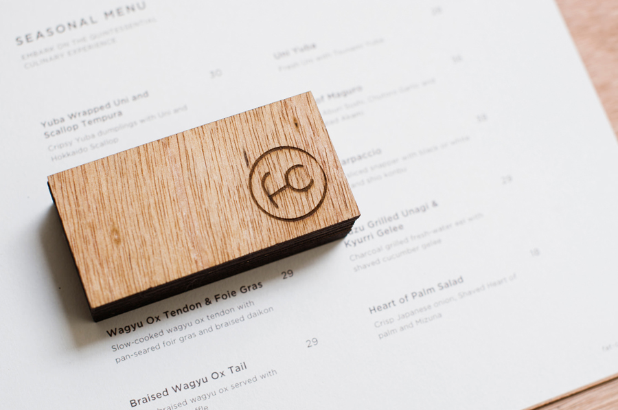
“Drawing inspiration largely from the Japanese aesthetic – Wabi Sabi – with traits that include simplicity, economy, austerity, modesty and the appreciation of the ingenuous integrity of natural objects and processes, wood is used primarily as the platform of this brand communication. Note the non-uniformity and texture to suggest the Wabi Sabi beauty of imperfection. The mark and the laser etching on the wood are also reminiscent of the branding of cattle.” – Foreign Policy
I really love how the philosophy that underpins the restaurant’s dining experience has been infused by Foreign Policy into its visual identity. Each component, whether that be a graphic or print asset, material choice or print treatment is, in isolation, elemental in either its construction, layout or application but united to form a layered and complementary visual experience without superfluous detail that feels honest and uncluttered.
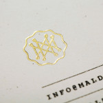
The monogram, built from a lowercase character combination and straightforward ligature detail, is clear in its presentation of imperfection through its non-horizontal lines and inconsistent distancing from a broken outline. This keeps its fine-line weight from becoming too trendy or clinical, gives it a sense of traditional authenticity and also functions as a traditional mark of guaranteed quality seared across each of the collaterals. The negative space contained within its circular form frames the earthy, uncoated and mixed tones of the wood surfaces, neatly conveying the untainted simplicity of ingredients and an open approach to cooking and presentation. The accompanying logo-type mirrors and complements the lightness of the mark with the functionality of a sans-serif geometric selection and generous letter spacing.
The heat treatment across the rich red/brown wood laminates and veneers draws in the grilled aspect of the menu while the light line weight, minimal, spacious and monochromatic execution of the printed menus introduces contrast and a delicate sense of placement and presentation. Unfortunately this simplicity has been heavily compromised by a very dull and superfluous website and an unforgivable use of gradients, drop shadows and bevels across the Facebook and Twitter avatars.