April’s Top 5 Projects 2012
Opinion by Richard Baird Posted 30 April 2012

Located in the Pool region of West Cornwall, Heartlands, previously home to a tin mine, recently underwent a period of redevelopment after 400 years of inactivity and was opened up to the general public this spring. The Heartlands’ identity, designed by UK based creative studio A-Side, takes the systematic approach of heavy industry, machinery and elemental materials and gives it a playful accessible twist.
Read the review here
Mal de Mar is a San Pedro, MX based business and on-line journal where art, design, architecture, photography and travel combine. The journal’s new identity, developed by ‘supermodernist’ design agency Face, captures and binds the timeless pursuit of knowledge and experience through travel and culture with that of the modern technological world with a contemporary fusion of light, symmetrical and consistent line work and the classic sensibilities of a broadly spaced serif logo-type.
Read the review here


DB Draught is an award winning New Zealand draught ale produced by Singaporean and Dutch owned DB Breweries, an Auckland based company that also brews for popular beer brands such as Heineken, Amstel and Tiger. This year DB Draught underwent a rebranding exercise, conducted by international studio Designworks, to develop the brand’s 80 year heritage and remain relevant to today’s customer.
Read the review here
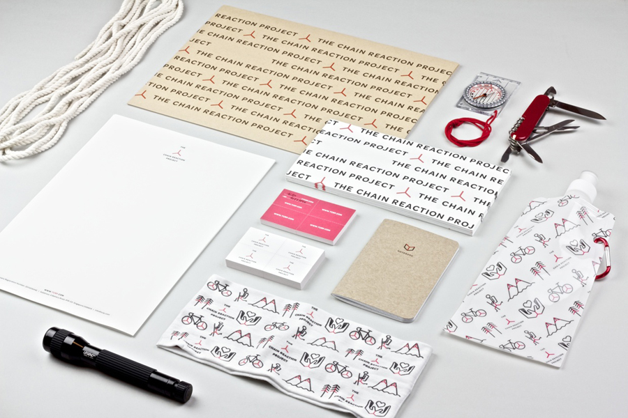
The Chain Reaction Project is a not-for-profit organisation founded in 2009 to aid developing countries through global community intervention. The organisation’s identity, developed by Singapore based independent design studio Bravo Company, takes a three pointed star as the basis for a larger network of assets that resolve the philosophies and the broad range of causes it aims to tackle.
Read the review here
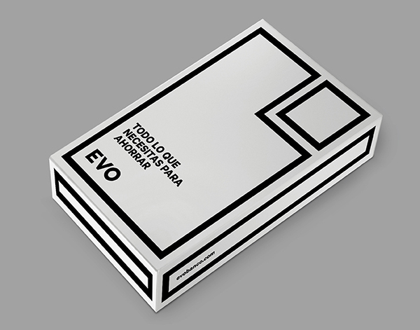
Last month saw the launch of Evo, a new bank with a customer first proposition and over 120 planned branches across Spain. Evo’s identity, developed by international design agency Saffron, utilises a geometric and monochromatic approach to visualise a clear, honest and understandable banking practice and its single product offering.
Read the review here