Reflect Lights by Designers United
Opinion by Richard Baird Posted 2 May 2012

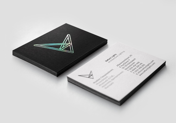
Reflect Lights is an architectural lighting design and supply firm based in the Greek city of Thessaloniki. Their new identity, created by independent design studio Designers United, visualises converging and refracting light trajectories as an abstract and three dimensional structural form to capture the concept of light moving within a contained three dimensional space.
“Placing particular emphasis on the architectural approach to the relation between light and shade and steadily following new technologies, the company is aiming to constantly confirm its design proficiency, technological perfection and aesthetic approach. The brief for the redefinition of the corporate identity included non-strict branding guides yet aimed at respresenting the notion of reflection, dimension and depth and imply notions of scientific approach and experience in applying cutting-edge technologies in the field of architectural lighting. Our design solution not only attempts to capture the key features of the company’s activities but also to express visually the contemporary philosophy and perception on issues relating to architectural lighting. Having as a foundation the fact that light is not an one-dimensional form and taking into consideration those linear elements that embody an architectural study, we tried to escape the constraint and awkwardness of one-dimensional approaches, which limit the portrayal of light itself, and created a graphic environment so as to capture the basic principle of light reflection within space not only as movement but as instinctive freedom and randomness as well.” – Designers United
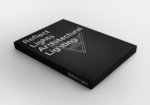
The similarity between reflecting light and the elemental structural form of a triangle, a fundamental component of modern architecture, is a very smart observation that neatly materialises the difficult theme of illuminated internal space delivering depth through duality. The symbol carries with it an almost sculptural sense of creativity and flexibility that is given further dimensionality through its intersection of a complementary rounded sans-serif typeface utilised across the catalogue. Its execution, as both a black and white (a juxtaposition of light and shade) and holographic print treatment (introducing a dynamic spectrum of colour) across the business card, builds a lot of conceptual value into a fairly simple two dimensional form.


